Wednesday, 20 October 2010

'Graphic Design...simple and effective'


Designed by 'New Future Graphic'
For 'LoveFilm'


Designed by: Stassja Mrozinski

When I read up on the story behind the creation of this poster I appreciated it alot more.  Basically, 'University regulations that came into force disallowing staff and students from putting posters up on the walls of the Lethaby building. Maintenance staff have enforced the ban, removing all posters that are not placed on notice boards and claiming that these posters pose a ‘fire risk’. The University of the Arts, however, continued to put up its own posters on the walls without rebuke. I highlighted the hypocrisy in the University’s judgment, by creating a series of ‘fire safety’ posters and ‘poster safety test’ stickers.' 


Friday, 15 October 2010

'Appropriate, creative, obsessive, frustrating, organised, structured...design lives in the detail'.

'Appropriate, creative, obsessive, frustrating, organised, structured...design lives in the detail'.


ENTER THE VOID- Opening Title Sequence


Director

Gaspar Noé


Design

Tom Kan


Kirlian Effects Research

Thorsten Fleisch
Production company
Wild Bunch, Fidélité Films

-If you have epilepsy don't press play.


Sagmeisters 'Another self indulgent design book' covers nearly all of the above.  http://iam.colum.edu/students/Michael.Wilgus/aim/Projects/6x6/image2.html


Designed by Job Wouters 'hand lettering and type work'


Bast/Faile Deluxx Fluxx

I like this alot.  I tend to keep up to date on anything 'Faile' are doing.  This was a collaboration with 'Faile' and 'Bast' and was presented in the 'Rathbone Place Gallery' in London from 12th Feb to 27th Mar 2010.   They basically designed everything to do with this 'interactive exhibition'.  The main attraction for me was the designs on the arcade games, which incorporate and manipulate existing work from each of the designers/artists.


'The 600 years' By

http://vimeo.com/15749093


Designed by: Johnson Banks
This poster was used for a lecture that 'encouraged simple ideas'.


Designer: Unknown


'Small Talk' by Anthony Burrill.

Love the minimal use of colour,  which emphasises its general bold feel, along with its layout and different point sizes used.


'A solution to a problem of communication through design.'

'A solution to a problem of communication through graphic design.'


Designed by Micheal Beriut.  

This is a typographic poster that uses 58 different arrows that point towards the programme of lectures spoken by well known architects.  -It definitely makes you look at the programme.


This is a film poster designed by Alex Cornell for a hypothetical film by Wes Anderson.


Created by '...And Company'

I'm not exactly sure what i think of this design.  I know I like the look of the poster, but I don't think it necessarily solves the problem of communicating to the viewer what the film is about.  However, its' purpose could be that it captivates the viewer with an interesting design and therefore communicates the message that this film is worth seeing.  Also, there is a quote at the top of the poster that states the movie is "flat- out funny" which reinforces the communication of a film to watch.


(Re-) Designed by - Unfortunately the website is in French and I do not understand French.  However I do appreciate its minimalistic design, which would've suited my 'Graphic Design...simple and effective' post, however, i think this successfully communicates a message of advertising the film through its design technique and simple use of colour.


Unknown designer.


Another one by Johnson Banks.  This is a logo designed to communicate the identity for the UK, Japan 2008 celebration of collaboration.


Wednesday, 13 October 2010

What is Graphic Design? - 'Graphic Design...simple and effective.'

'Graphic Design...simple and effective.'


-Perhaps abit bias.  But, actually, no.  Brilliant design.  Totally simple use of colour and space- this album cover defines the quote above.


Created by: 'DDB&CO., Istanbul, Turkey"


The Suburbs eight covers

Album Artwork Design by Caroline Robert
Art Direction by Vincent Morisset
Photos by Gabriel Jones


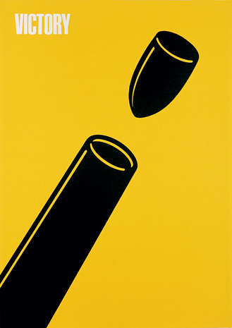
'Victory Poster'
Designed and created in 1945 by Shigeo Fukuda


Tuesday, 5 October 2010

Visual Language- Sequence


This is an Aircraft Safety Card sequence.  It shows how to buckle your belt; how to sit properly etc.  

Oldboy - 25:1 Fight Scene (HQ)


This is a fight scene from the Korean film 'Oldboy'.  I thought it was fitting because it is a sequence of people fighting, also, it is filmed so well and its just impressive to watch.

How to Dial a Rotary Telephone


This is an official old school sequence showing the general public 'how to dial a telephone'.