Friday, 18 November 2011

Beyond- Part I

Beyond - Part I
Beyond the International Year of Astronomy print series, 2011, by graphic designer and illustrator, 
Simon C Page.


 The International Year of Chemistry,


To remember!
All of these designs are in poster format.  They are simple and the main aspect is the imagery.  Page has used different weights and textures through patterns to make this minimalist design very interesting and arresting.  The latter is something I need to achieve when designing in general for my clothing company.  These posters are promoting something educational, as will I.  I think the reason they work so well is because of the strong visuals- something I should incorporate?
Think about it.

Monday, 14 November 2011

RE- Branding.

10 November 2011 | By Anna Sanina
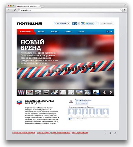
Russia has begun the rebranding of its police, which is to become a completely innovative Russian Police brand. The new brand targets both law-enforcement authorities and community using a clear and simple language of visual communications. 


Photo: New Russian Police visual identity, from newpolice.ru
The new brand image of the state structure doesn’t distance from people as the modern policeman has to be an example in all spheres of life including his outlook, high cultural level and behavior.
The militia was renamed to police earlier this year. In February a research was made that showed that people in Russia have a negative attention to the reform and that the police need a total rebranding in both ideological and communicational spheres.
The key symbol of changes in the Police brand is its new bright tricolor ornament that appears on police vehicles and uniform. The ornament is easily transportable to any carriers remaining recognisable. The Cyrillic word Police uses an original font and chevron, a V-shaped military symbol.


Specialist finishing


Embossed for certain.  However, unsure whether they have printed black with a spot varnish or just glossy black foil.
Smel identity design
Smel identity designSmel identity design

Wall vinyl.  Simple and bold in this monochrome environment (not just the photograph).


More on wall vinyls


Another Example for Dry London.


This has given me an idea to incorporate some form of vinyl visual within the store of my company.  However, this time, using colour- and lots of it.  Will be an interesting contrast between my block black and white logo.


Friday, 11 November 2011

"Expectation management", Generation Press.


Generation Press.

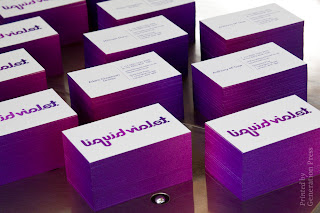
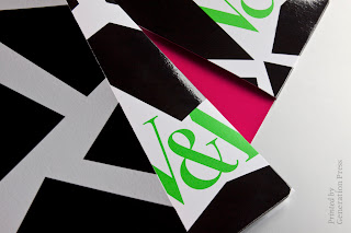
One of the first pieces of advice we were given was that we have to "manage our expectations".  More specifically with colour.  There are so many factors that have to be thought about that can change print.  For example, a colour will never print exactly the same as the pantone reference book, (even if the same stock is used) because of the amount moisture within that paper.  The moisture affects the print because of 'dot gain'- this is the amount of surface ink covers once it has reached the paper.  It will always increase, but there are ways of controlling that number- i.e. amount of moisture in paper.  Dot gain is how colour is measured in print.  Another point,it seems obvious, but it is easy to forget, that stock choice also changes the assigned colours, cheaper stocks generally tend be less pure white, with a hint of yellow. This undertone of colour will taint the initially designed/ desired colour.  


When working with images for print, you can think of it as an "iceberg"- there is so much data under the surface of the initial photograph when it is imported into programmes.  First of all, ALL images must be shot in RAW. format, this is because it is possible to hold much more information this way, which will work to your advantage when editing, and even further when sending to print.  There are certain ways to edit images.  If you do not edit your images correctly then you end up modifying, deleting, cutting, adding aspects that it looks amazing on screen, but when it comes to printing the image is fuzzy and full of noise- and this is something that I nor anyone else needs/ wants in life.  Use curves and selective colours- and very little else, so that the original data of the image is still stored.  Only go as far as +5% and -5% or else information will begin to get lost, reducing the quality of the final print.

Tints:  It is VERY difficult to print any tint at 50%.  If you want around that amount try 55%
           Also, don't confuse tints with transparency and opacity- it happens TOO often


CMYK and Spot Colours.  If working on a job it comes to light that you are using too many spot colours and it will be to expensive to do so, you can generally find some form of CMYK replacement.  This usually works best with coloured panels/ boarders/ headings and such like.  So, if you convert these colours to CMYK and look at the percentages, you may find a certain colour with a very low percentage.  If this occurs, try taking out that colour fully, and adding to another higher colour, e.g. if Y was 3% and M was 96%, have a go at upping the percentage to 100%.  This creates a less muddy colour that can sometimes look very similar to the desired spot colour.


"Simplifying your artwork is key to giving it a crisp finish".

Print Considerations:


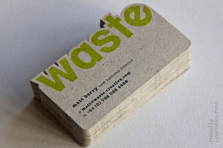
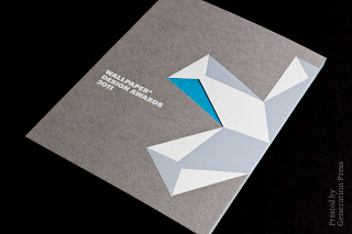
Stock considerations.  Make sure that not only does the stock you choose look good, but that it is relevant also. It gives the concept more depth, adding quality to the overall design.


Wednesday, 2 November 2011

Design Museum London


Kenneth Grange.  Making Britain Modern.
'Kenneth Grange is Britain’s leading product designer, his prolific career spans over 50 years and he is responsible for designing some of the most iconic and familiar products and appliances that shape our daily lives. Kodak cameras, the silhouette for the Intercity 125 train, Kenwood food mixers, Parker pens, and the re-design of the London black cab are just some of his well-known designs.
In 1972 Grange, together with Alan Fletcher, Theo Crosby, Colin Forbes and Mervyn Kurlansky established Pentagram, a world renowned multi-disciplinary design consultancy. More recently, in the 1990s, Grange has produced distinctive designs that have become part of our landscape, from the Adshel bus shelter in 1993 to the Rural Post box for Royal Mail in 1998. Today Grange continues to work with British companies includingAnglepoise, furniture designer Hitch Mylius and fashion designer Margaret Howell.
This exhibition is Kenneth Grange’s first UK retrospective celebrating his work, design journey and the role he has played in making Britain modern. With unique access to the Grange archive, the exhibition includes over 150 products, prototypes, sketches as well as audio, photography and film.'


This is my favourite blue.


Making Britain Modern?________________
In my opinion, it is the sheer volume of products designed by Grange, and the areas in which they span across.  When looking at his work as a collective, you see such versatility across a large range 
of materials and subject matter.


This Is Design.

'Designers in Residence:

Designers in Residence is the annual residency programme, run by the Design Museum, which celebrates new and emerging design talent. Now in its fourth year, the residency supports the selected designers at an early stage of their career, allowing them to build on their current design practice and develop new or existing work. The Designers in Residence have been given a bursary to support the development of their career and guidance in creating a new piece of work for the exhibition.
Selected through an open-call for applications, the finalists were asked to respond to a brief to consider the idea of imperfection either in an object, environment or experience. See their remarkable designs in the gallery.'
Will Shannon.
'Prior to studying at the RCA Will Shannon worked as a studio assistant to artist Anthony Gormley. Shannon’s current work merges the role of designer, maker and manufacturer to create travelling workshops. His previous works include a mobile gold smelting plant and a travelling workshop housed on a bicycle that was resident at the Urban Orchard during the 2010 London Festival of Architecture. For the Designers in Residence programme Shannon is proposing ‘Autonomous Workplace no004: Mobile Chipboard Factory’ a travelling production line which creates new products from unwanted furniture.'

Sourced:  http://designmuseum.org/media/item/77962/3938/press-release-final.pdf


Jade Folawiyo

'Product designer Jade Folawiyo studied at Central St Martin’s and draws inspiration from her Nigerian heritage. For the residency Folawiyo will explore and celebrate the tarnishing and rusting of metals. Folawiyo is inspired by the ways different cultures share ideas and practices, bringing new approaches to previously forgotten traditional crafts. As part of a gap year in 2009 Folawiyo worked in Italy as part of Fabrica, Benetton’s design communications research centre at Treviso. Folawiyo’s work has been exhibited at Design Miami, Maison et Object and at the Secondome gallery in Rome.'

Sourced: 
http://designmuseum.org/media/item/77962/3938/press-release-final.pdf