Showing posts with label OUGD102. Show all posts
Monday, 14 February 2011
Design for Screen, Cont
http://www.youtube.com/watch?v=R2F_hGwD26g
I like the look of this video. More illustrative which isn't usually what I go for but I think this is very impressive- really raw and vivid, which just adds to its' general intensity.
Another music video, i'm not quite sure whether this is the official one but it doesn't matter. I think the general progression of the illustrations with the music works so well. At first simple, calming imagery is used, telling a story. Then, it gets aggressive- red is introduced into the monochrome video, along with more powerful imagery with fast paced scenes. Essentially, if you get into the music and watch the video its pretty intense.
Designed by Gaston Vinas. If you like this then look at the site below. There is a collection of music videos that are just as striking as this
http://grapevineindustries.com/
This is a lovely website. For a lovely band.
-it's nice to look at.
http://www.neonbible.com/readme.html
Same band, better site. This is an interactive music video.
I had fun.
http://www.beonlineb.com/
Thursday, 10 February 2011
Collection 100, Existing leaflet research
I think to get an idea of what i'm going to be designing for my leaflet not only do I need to consider my existing poster designs/ colour schemes/ layouts etc, I need to also get some contextual awareness of existing leaflets. The specific type of leaflet designs I am looking at are for charities. Though I am not designing my leaflet for any charity in particular the subject matter still revolves around this theme.
http://www.creativegiant.co.uk/portfolio/norwich-city-council/literature/
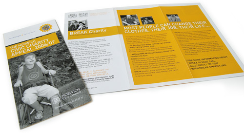
Designed by 'Giant'. The use of two colours plus stock works well yet also takes budget into consideration.
Simple designs. Not sure on the typeface used, however, the message is communicated quickly and successfully.
The infographics approach is also used here. It works for the target audience in that the type and images are easy to understand.
It is set out as a concertina fold with information on both sides. I think perhaps this is more successful in communicating information rather than my 'concealing and revealing' attempt and interactive designs.
From my existing research I have found that a simple concertina leaflet will work the best for my designs- check out design practice blog.
http://www.creativegiant.co.uk/portfolio/norwich-city-council/literature/
Civic Charity leaflet 2006/07
A leaflet to promote BREAK, the charity chosen by Norwich's Lord Mayor and Sheriff for their year in office. We were asked to produce an eye-catching yet not glossy leaflet that showed the aims of the charities and called people to action.
Designed by 'Giant'. The use of two colours plus stock works well yet also takes budget into consideration.
Simple designs. Not sure on the typeface used, however, the message is communicated quickly and successfully.
The infographics approach is also used here. It works for the target audience in that the type and images are easy to understand.
It is set out as a concertina fold with information on both sides. I think perhaps this is more successful in communicating information rather than my 'concealing and revealing' attempt and interactive designs.
From my existing research I have found that a simple concertina leaflet will work the best for my designs- check out design practice blog.
Design for Screen
An interesting digital infographic on the operation of an 'Astra' satellite. Created by 'This is Real Art'.
Seven short animations make up the final resolution. The outcome? You actually do understand the operation of a satellite. So to me this is successful in communicating its message.
'Meowmania'.
There is little purpose in the design of this site. Except to entertain. For a moment. However, on a critical note I like the colour editing and white background- simplicity.
The Maccabees music video 'No kind words'.
Directed by Ruth Render and Orlando Weeks.
Another music video. I'm strangely unsettled by this video. I think it's the total personification of a dog- rejected by society.
Directed by Spike Jonze, a successful music video director.
'Logorama'
At the risk of sounding like the ultimate cynic, this is truth. And a creatively humerous way to communicate this idea. I love the video, yet brings home in an oxymoronic way- it is ultimately a horrible fact that we are surrounded and controlled by all of this (in my opinion), however, it is put across in such a happy, bright way. Most specifically the introduction.
Tuesday, 8 February 2011
Book Binding
Some interesting book binding techniques:
There's a lovely organic feel to this one. The exposed pages and plaited string at the spine give a totally handmade look which, I think makes me have more appreciation for it.
Design for Screen
A nice bit of stop motion promoting 'PES'. Creative way to advertise the product. It reflects the fun nature of the product by using it in something that provokes nostalgia and fun.
Concept and animation by PES.
This is just a brilliant advertisement. Testament to the fact that a little bit of humour goes a long way in getting a reaction from the viewer.
Designed by Leo Burnett, Paris.
One of those 'good because it is so bad' designs. They are clearly making a statement with this one- down to the scroll bar at the side of the screen, making it difficult for the user, with the rest- empty space filling the screen. Either that or it is just bad.
http://www.ephameron.com/#

This has been designed by a guy named Rafael Rozendaal. He designs art on a URL then sells the URL, however, they are all thankfully still public. Below is his home site and below that is the specific resolution in the image. You could spend hours on this stuff.
http://www.newrafael.com/
http://www.towardsandbeyond.com/
Directed by Mikey Please 'The Eagleman Stag' won a BAFTA for this years short animation category. It is created using the stop motion technique and as far as I can tell, paper crafting. It looks visually stunning and I think its simplicity in colour and complexity within the frames adds to this.
Unfortunately this is just a trailer but I can't wait to be able to see the whole 9 minutes.
So once finding this video I somehow got onto a website called 'Agile Films'.
Here's another stop motion by Mikey. It's a playful design that makes me laugh- another quality animation.
Saturday, 5 February 2011
Design for Screen
'Frontier phsychiatrist', The Avalanches.
Directed by 'Tom Kuntz'.
A perfect example in my opinion of humour successfully reaching the audience.
Tetris. I love this game, yet I have a love/hate relationship with it's design. There are obviously many different versions designs of this timeless classic. Arguably, function seems to follow form in this design, I feel it has a lot more potential to grow visually, yet still, I think there is a charm in it's simplicity. I think you also have to take into context the time in which it was designed- at this time, this design would have been very impressive. However, analysing it in 'the now' I feel that the design has become classic, a style for other designers to take on- adopting and adapting it as a 'retro look'. Possibly a question of reputation over quality?
Another music video, 'Rude Boy' by Rihanna.
This is a really entertaining visual design, where colour and movement have clearly been thoroughly thought out.
Directed by 'Melina Matsoukas'
The use of vivid, strong colours and patterns in this video give it a retro feel with a modern look that appeals to a wide audience, and, essentially, wakes them up.
The 'Rude Boy' video has been criticised for essentially copying M.I.A's 'Boyz' video. I see the similarities and understand the accusations, however I think the money gone into Matsoukas' video definitely works in its visual favour, making it a bit more crisp.
Unfortunately the video was not available to embed onto my blog so here is the link:
http://www.youtube.com/watch?v=w1SJKF_sQrw&NR=1
Directed by 'Tom Kuntz'.
A perfect example in my opinion of humour successfully reaching the audience.
Tetris. I love this game, yet I have a love/hate relationship with it's design. There are obviously many different versions designs of this timeless classic. Arguably, function seems to follow form in this design, I feel it has a lot more potential to grow visually, yet still, I think there is a charm in it's simplicity. I think you also have to take into context the time in which it was designed- at this time, this design would have been very impressive. However, analysing it in 'the now' I feel that the design has become classic, a style for other designers to take on- adopting and adapting it as a 'retro look'. Possibly a question of reputation over quality?
Another music video, 'Rude Boy' by Rihanna.
This is a really entertaining visual design, where colour and movement have clearly been thoroughly thought out.
Directed by 'Melina Matsoukas'
The use of vivid, strong colours and patterns in this video give it a retro feel with a modern look that appeals to a wide audience, and, essentially, wakes them up.
The 'Rude Boy' video has been criticised for essentially copying M.I.A's 'Boyz' video. I see the similarities and understand the accusations, however I think the money gone into Matsoukas' video definitely works in its visual favour, making it a bit more crisp.
Unfortunately the video was not available to embed onto my blog so here is the link:
http://www.youtube.com/watch?v=w1SJKF_sQrw&NR=1
Thursday, 3 February 2011
Collection 100, 'What a charity could buy'
Bernardo's:
NSPCC:
RSPCA:
OXFAM:
Because the total amount of money is £63.77, perhaps I could highlight the fact that if a certain percentage of people gave their '63p' then it would amount to something a lot more meaningful than a dairy milk.
-
Subscribe to:
Posts (Atom)