Showing posts with label OUGD104. Show all posts

Wednesday, 20 April 2011

Interesting designs with a natural aspect. -'what is a line'


The design above is the Creative Review marketing for their 'Illustrator Annual' competition.  Much like the stock sample design on my older post, this design has a similar look.  My thoughts here are more towards the shapes than the colours.  More specifically the orange shape going across the centre of the frame.  It mirrors shapes of natural landscapes which, in turn have a sound wave look about them.


Unfortunately the resource I obtained this piece of design from did not state who is was designed by.  However, the site it is featured on is http://www.patternity.co.uk/.  This table is something I stumbled upon, yet seems to be the most inspiring for this project.  The aspect I find most interesting about this design is the contrast in textures and line.  There is the contrast of flowing line to the more harsh angular line that is exactly what I am looking for.

From all of this I have found that, visually, sound and nature go hand in hand, and a collaboration of these two things within one design could create some interesting shapes that not only look visually stimulating, but also mean something- communicating a sound through an image, inspired by the shapes of nature.


The images above are all drawn by Marissa Textor.  As stated above, here shapes are created with natural content.  My idea is more of creating a natural shape with a more textured content that does not mirror the subject matter of the shape.  These drawings are all really interesting form a graphic point of view.

Tuesday, 19 April 2011

What is a line, natural inspiration.


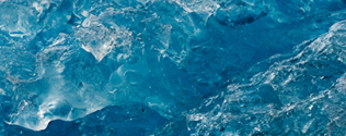
The aspect that has inspired me for the 'What is a line' brief are the bold shapes and suggestive directions within them.  My idea is all about the visualisation of sound, more specifically, music.  Within music there are flowing melodies and hard beats- both of which are present in natural structures such as mountains and icebergs.


The images above have all been taken by the photographer Camille Seaman.  They clearly identify the shapes I have been talking about and the contrast of line within one natural area.  


The three images above have been taken by the photographer David Ryle.  To me, the idea of taking a natural form and manipulating it into something unnatural can create interesting results.  For example, keeping a certain aspect of this natural form, i.e the solid outer shape and inserting something near to its opposite

What is a line, natural inspiration within contemporary design.


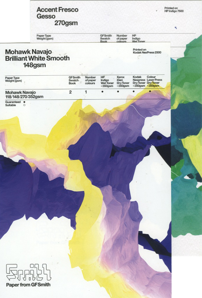
I recently acquired this lovely package.  It's a collection of digital print test paper from the company GFSmith.  As interesting as the stock choices were, it was more the designs on the stock that caught my attention.  The design mirrors natural mountain and iceberg shapes, yet the colours do not.  I love the visual aspect and versatility of colour within the consistency of the design.  It is a visually engaging way to advertise stock, one that forces attention.

Here i've taken inspiration from the shape of this design and adapted it into my project.  It relates because it is similar to soundwaves- i find the shapes inspiring because of their flowing lines.

Thursday, 17 March 2011

What is a line? Things of interest.


I found this in the 'resource' section of the site 'Patternity'.  It looks amazing yet also ties in well with my idea of crafting my final resolution.  Seeing as it is a subject area I feel I have neglected it's time I had a go at hand crafting something.  So to do this i'll need to research as much as possible.


Some experimentation with light.  I think it's a good example of how light can make something look totally different- something to think about with my sculptures.


Scanned in from the book 'Stereo Graphics', one that I think will be a constant source for this specific brief.  Makes me think more in a graphic design sense and less in a fine art mindset- i still need to remember that communication is the main aim.

Monday, 28 February 2011

Book Works

STOCK:


One colour stock with one colour print.  I think this would look interesting given its simplicity.
Also, if I end up using a photographic image this would also work well.
It is something to think about to "jazz" up cheap production.

Tuesday, 8 February 2011

Brief: 'Book Works'

After researching interesting words beginning with 'a', I have found a select few that have potential to be successful in getting a reaction from a wider audience.


The first is the 'ai - three toed sloth'.
- Three toed sloths are around the size of a small dog.
- Unlike two toed sloths they have a small tail.
- It is closer to a reptile because it does not have a constant body temperature.
http://en.wikipedia.org/wiki/Three-toed_sloth


'Allantoid' - 'shaped like a sausage'.
Referring to 'allantois'.
I thought creating a book on 'Things shaped like a sausage' would be humorous and interesting.  However, this blunt definition isn't quite how it seems.
There is no true definition, but the general gist is that of biology within plants and animals.
So, in short.  This is not what I thought and my original idea will not stand.


'Agrostology' - 'study of grass'.


'Agrostology (from Greek ἄγρωστις, agrōstis, "type of grass"; and -λογία, -logia), sometimes graminology, is the scientific study of grasses. It typically encompasses the true grasses (the family Poaceae), as well as the more grasslike species of the sedge family (Cyperaceae), the rush family (Juncaceae), and the bulrush or cattail family Typhaceae. Grasslike plants are also referred to as graminoids.
Agrostology has importance in the maintenance of wild and grazed grasslands, agriculture (crop plants such as rice, maize, sugarcane, and wheat are grasses, and many types of animal fodder are grasses), urban and environmental horticulture, turfgrass management and sod production, ecology, and conservation.'

Thursday, 3 February 2011

Visual language, paper crafting.

On from the 'magazine manipulation', I thought to look at some other forms of paper crafting involving reading material.


Unfortunately the designer is unknown for this piece.  This is an interesting way of creating content within a book, whilst still keeping the original 'innards'.  I think this is an original concept that also works with the idea of deconstruction- the different layers make it hard to read, pushing people to look harder.


All three of the above have been created by Matt Shilan.  He uses everyday materials including paper, newspaper and magazines, the two outer designs have been created using magazines.  I think that this is such an interesting, impressive and visually stimulating approach to 'recycling'.

Wednesday, 2 February 2011

Visual Language, Magazine manipulation


This is a hotel designed by Frank Ghery.  I found the post on itsnicethat.com whilst looking for other things.  It's not much in the way of paper crafting, yet reminded me of a much more successful, architecture based version of my second magazine fold.  The hotels main visual aesthetic are the wafer thin curves, protecting the contents of this building.

Thursday, 27 January 2011

Colour Theory, further reading

 
Colour psychology.
Some colours, such as blue naturally calm.  It is argued that the meaning of a colour exists not because of cultural or social conditioning but it naturally makes us feel the way we do.  Blood is naturally red, which connotes danger and pain- so the existing semiotics don't carry the colours meaning, they simple make it stronger.
The Trichromatic theory.
THE PRISM.  The combination of three primary colours of light to re-create the entire spectrum is known as additive mixing. It starts form an absence of light.  The light of each primary is added to produce progressively lighter tones.  Mixing an equal amount of each primary results in 'white' light.  For example, addative mixing is evident in TV screens/ Computers etc.
Additive and subtractive mixing.
The first model above is the Additive mixing (RGB), the second is Subtractive mixing (CMYK), and the third is Subtractive Mixing (RYB)
Onto Subtractive.  Instead of pigments that absorb all but a certain primary, pigments that absorb only a certain primary are used.  From white you can then reverse the additive process by applying more pigment, subtracting more of each primary until black is left.  The colours that absorb the primaries are their complementaries.  Cyan absorbs re, magenta absorbs green and yellow absorbs blue.


Wednesday, 1 December 2010

Visual Language,


Channel 4 1982 ident.


 Channel 4 ident, 'Diner' 2004


Channel 4 ident, 'Tokyo'


Monday, 1 November 2010

Visual Literacy, Design Principles

Semiotics

Visual Metaphor,
A visual metaphor is used to transfer the meaning from one image to another.  Although the images may have no close relationship, a metaphor conveys an impression about something relatively unfamiliar by drawing a comparison between it and something familiar.


Visual Metonym,
A visual metonym is a symbolic image that is used to reference to something with a more literal meaning.  By way of association the viewer makes a connection between the image and the intended subject.  Unlike a visual synecdoche, the two images bear a close relationship, but are not intrinsically linked.  And unlike visual metaphors, metonyms do not transfer the characteristics of one image to the other.


Visual Synecdoche,
This term is applied when a part is used to represent the whole, or vice versa.  Quite simply, the main subject is substituted for something that is inherently connected to it.  The substitution only works if what the synecdoche represents is universally recognised and understood, rather than taken at face value for its literal meaning.  The ability to refer to a group or class of objects through a visual device enables a designer to convey an idea in a clean and unfettered manner.