Friday, 22 October 2010

Paul Pensom


Paul Pensom came in today to give a lecture on his work and experiences within different magazines and agencies.
To begin with he was basically into music and magazines as they are "never complete and always transient", which i totally agree with and find pretty inspiring for a fairly obvious observation.  He spoke about the responsibility and power you have when you work on these projects.  You can make such a massive point because of the nature of the magazine- you have a chance on the front cover to put across what you want with little or no interruption.  He brought up the 1966 infamous issue of esquire:


It's a quote from a soldier in Vietnam.  Even though it is so short, you get so much from it.  It makes me feel shocked; compassionate; angry; upset.  I think you've got it right for sure when emotion comes into the situation, if you're able to make someone feel something then you've already got them engaged, and thus, you've got them- you've done your job at selling the magazine.  

Pensoms' career began in impressive and innovative areas.  One of his first placements after his degree was with 'I.D' magazine, which at that point (around 1996) had a fairly provoking yet innocent nature about it, before high- end fashion ads drowned its pages.  


He also worked on the music fanzine: 'FACT magazine'.


'Creative Review' is another one on Pensoms' extensive list.  He's been working with them from 2007- present and has been involved in numerous aspects of re-design.  He redesigned the magazines title to the 'C.R' initial encased in the square format which he "didn't like personally, but it was easily recognisable because of its' simplicity and allows itself to be manipulated".  


However they felt that after this it looked too isolated, like it wouldn't make sense to those who didn't know what it was.  -And they didn't want that.  It had to be open to anyone, the tone had to be that of "a peer, and not a boss telling you what to think is good or not".  So, Pensom came up with a re- design.


The cover is supposed to symbolise a 'New dawn", which I think in context of the redesigning works really well.  It is simple and effective. 

Wednesday, 20 October 2010

'Graphic Design...simple and effective'


Designed by 'New Future Graphic'
For 'LoveFilm'


Designed by: Stassja Mrozinski

When I read up on the story behind the creation of this poster I appreciated it alot more.  Basically, 'University regulations that came into force disallowing staff and students from putting posters up on the walls of the Lethaby building. Maintenance staff have enforced the ban, removing all posters that are not placed on notice boards and claiming that these posters pose a ‘fire risk’. The University of the Arts, however, continued to put up its own posters on the walls without rebuke. I highlighted the hypocrisy in the University’s judgment, by creating a series of ‘fire safety’ posters and ‘poster safety test’ stickers.' 


Friday, 15 October 2010

'Appropriate, creative, obsessive, frustrating, organised, structured...design lives in the detail'.

'Appropriate, creative, obsessive, frustrating, organised, structured...design lives in the detail'.


ENTER THE VOID- Opening Title Sequence


Director

Gaspar Noé


Design

Tom Kan


Kirlian Effects Research

Thorsten Fleisch
Production company
Wild Bunch, Fidélité Films

-If you have epilepsy don't press play.


Sagmeisters 'Another self indulgent design book' covers nearly all of the above.  http://iam.colum.edu/students/Michael.Wilgus/aim/Projects/6x6/image2.html


Designed by Job Wouters 'hand lettering and type work'


Bast/Faile Deluxx Fluxx

I like this alot.  I tend to keep up to date on anything 'Faile' are doing.  This was a collaboration with 'Faile' and 'Bast' and was presented in the 'Rathbone Place Gallery' in London from 12th Feb to 27th Mar 2010.   They basically designed everything to do with this 'interactive exhibition'.  The main attraction for me was the designs on the arcade games, which incorporate and manipulate existing work from each of the designers/artists.


'The 600 years' By

http://vimeo.com/15749093


Designed by: Johnson Banks
This poster was used for a lecture that 'encouraged simple ideas'.


Designer: Unknown


'Small Talk' by Anthony Burrill.

Love the minimal use of colour,  which emphasises its general bold feel, along with its layout and different point sizes used.


'A solution to a problem of communication through design.'

'A solution to a problem of communication through graphic design.'


Designed by Micheal Beriut.  

This is a typographic poster that uses 58 different arrows that point towards the programme of lectures spoken by well known architects.  -It definitely makes you look at the programme.


This is a film poster designed by Alex Cornell for a hypothetical film by Wes Anderson.


Created by '...And Company'

I'm not exactly sure what i think of this design.  I know I like the look of the poster, but I don't think it necessarily solves the problem of communicating to the viewer what the film is about.  However, its' purpose could be that it captivates the viewer with an interesting design and therefore communicates the message that this film is worth seeing.  Also, there is a quote at the top of the poster that states the movie is "flat- out funny" which reinforces the communication of a film to watch.


(Re-) Designed by - Unfortunately the website is in French and I do not understand French.  However I do appreciate its minimalistic design, which would've suited my 'Graphic Design...simple and effective' post, however, i think this successfully communicates a message of advertising the film through its design technique and simple use of colour.


Unknown designer.


Another one by Johnson Banks.  This is a logo designed to communicate the identity for the UK, Japan 2008 celebration of collaboration.


Wednesday, 13 October 2010

What is Graphic Design? - 'Graphic Design...simple and effective.'

'Graphic Design...simple and effective.'


-Perhaps abit bias.  But, actually, no.  Brilliant design.  Totally simple use of colour and space- this album cover defines the quote above.


Created by: 'DDB&CO., Istanbul, Turkey"


The Suburbs eight covers

Album Artwork Design by Caroline Robert
Art Direction by Vincent Morisset
Photos by Gabriel Jones


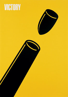
'Victory Poster'
Designed and created in 1945 by Shigeo Fukuda


Tuesday, 5 October 2010

Visual Language- Sequence


This is an Aircraft Safety Card sequence.  It shows how to buckle your belt; how to sit properly etc.