Thursday, 28 April 2011
Monday, 25 April 2011
Perspective drawing, 'what is a line?'
Architectural drawing, Perspective and rendering
Farey and Edwards


Because one of the main points to my project is that I want to go back to basics- increase my drawing skills, the direction my project has taken leads me here. I need to be able to effectively produce an image that draws you in, has depth and jumps out at you. I think that if I get the perspectives right within my final resolution it has the potential to look impressive.
I have referenced this book more as a visual aid rather than facts- the book reads more like one long opinion rather than facts. However, these images are the most helpful to grasp a sense of perspective that I have seen.
I have referenced this book more as a visual aid rather than facts- the book reads more like one long opinion rather than facts. However, these images are the most helpful to grasp a sense of perspective that I have seen.
I've read up on perspective drawing and practiced it on my 'dp' blog, and feel that it has helped immensely.
Wednesday, 20 April 2011
Where is Graphic Design found?
Where is it meant to be seen? In what situation or at what scale? How is the audience supposed to receive it and are they meant to interact with it?
Print:
Unfortunately I found all of these prints on foreign sites. However, I think that these three designs are all successful in their use of colour. They have been printed in a relatively small format so therefore I would presume are designed to be picked up and interacted with.
This first design below is successful in my opinion because of its simplicity, layout and interesting contrast in texture. The use of foil blocking draws you in and makes you want to pick it up.
All three have a strong use of shapes, directing the eye, highlighting areas.


Graphic sculptures:
Jen Stark:
-Paper crafting at its best.


It works because it breeds happiness. First of all you see the colours and the complex shapes- it looks very nice indeed. But then you find out that it is all done by hand, and your mind is blown. These pieces are designed to be exhibited- so therefore not to be touched just looked at. The audience are supposed to be entertained, excited, impressed. And they are. Everyone i've spoken to has all of Starks' work- and why wouldn't you? Your bombarded with bright colours and shapes. I think it's the innocent feel of all her work that the viewer connects to. It makes you feel like a kid again- cutting out coloured card and sticking it together- yet it holds much more skill and imagination.
- trippy.
Type:
Title sequences to films often have really interesting ways of depicting names.
Here's one of my favourite:
Here's one of my favourite:


Throughout this whole film type is a general theme. Below is an interview with the designer of the title sequence Ben Conrad:
ATS: Did the ‘rules’ stem from the title graphics or vice versa? Or were both always planned that way?
BC: The rules and title sequence evolved separately, but in the end came to a more understated simple approach. The goal was to integrate the type into the film and propel the narrative without becoming heavy-handed. The film is essentially a comedy, and we felt that punctuating the humor with a simple typographic approach was the way to go.
ATS: And what about the placement and interaction of the typographic elements? What were the various stages that went into producing those shots?
BC: The interactive animation of the type first started with the rules and eventually made their way into the main title sequence. We wanted to seamlessly integrate the type into the scene, making the type become another character. We were inspired by the tension between beauty and horror that the slow motion footage created. The goal for the type was to respond to that horrific grace, to react to the movement.
Soucred from: http://www.artofthetitle.com/2010/04/05/zombieland/
This type has been designed for a title sequence. The main aim is for the type to interact with its surroundings- to move when something crashes into it. The reason this title sequence is so successful is because of many things. I think that the addition of the track can add a lot of emotion to something, and in this case it is. However, the things moving the type is what makes is humorous- the context in which it is placed- the gritty horror juxtaposed with light contrasts such as a three legged father son race just increases the humor behind it.
Another one:
The Hangover by Todd Phillips


Unfortunately I couldn't get anything other than German video footage of this one so it's stills. Though, the reason I think this works so well is because of its cinematography. Even as stills the composition and colours of these images look as if they could be a static poster. Even taken out of context this design works well. My favourite still would be the top- i love bold, block, harsh typography against a natural setting.
Typography:
 sourced from designspiration.net:
I found this interesting again because of its' natural look against block type. Its something i've seen plenty before but it's nice nontheless.
The type works well and has a sort of rustic feel. It reminds me of an album cover. The layout of the text against the square format means it would work well in a C.D context.
Branding:
" "
 I think I like branding. Unfortunately the background for this is unknown, however I think it is a solid image that is memorable and that's how it should be.
BC: The interactive animation of the type first started with the rules and eventually made their way into the main title sequence. We wanted to seamlessly integrate the type into the scene, making the type become another character. We were inspired by the tension between beauty and horror that the slow motion footage created. The goal for the type was to respond to that horrific grace, to react to the movement.
Soucred from: http://www.artofthetitle.com/2010/04/05/zombieland/
This type has been designed for a title sequence. The main aim is for the type to interact with its surroundings- to move when something crashes into it. The reason this title sequence is so successful is because of many things. I think that the addition of the track can add a lot of emotion to something, and in this case it is. However, the things moving the type is what makes is humorous- the context in which it is placed- the gritty horror juxtaposed with light contrasts such as a three legged father son race just increases the humor behind it.
Another one:
The Hangover by Todd Phillips


Unfortunately I couldn't get anything other than German video footage of this one so it's stills. Though, the reason I think this works so well is because of its cinematography. Even as stills the composition and colours of these images look as if they could be a static poster. Even taken out of context this design works well. My favourite still would be the top- i love bold, block, harsh typography against a natural setting.
Typography:

I found this interesting again because of its' natural look against block type. Its something i've seen plenty before but it's nice nontheless.
The type works well and has a sort of rustic feel. It reminds me of an album cover. The layout of the text against the square format means it would work well in a C.D context.
Branding:
" "

Interesting designs with a natural aspect. -'what is a line'


The design above is the Creative Review marketing for their 'Illustrator Annual' competition. Much like the stock sample design on my older post, this design has a similar look. My thoughts here are more towards the shapes than the colours. More specifically the orange shape going across the centre of the frame. It mirrors shapes of natural landscapes which, in turn have a sound wave look about them.

Unfortunately the resource I obtained this piece of design from did not state who is was designed by. However, the site it is featured on is http://www.patternity.co.uk/. This table is something I stumbled upon, yet seems to be the most inspiring for this project. The aspect I find most interesting about this design is the contrast in textures and line. There is the contrast of flowing line to the more harsh angular line that is exactly what I am looking for.
From all of this I have found that, visually, sound and nature go hand in hand, and a collaboration of these two things within one design could create some interesting shapes that not only look visually stimulating, but also mean something- communicating a sound through an image, inspired by the shapes of nature.


The images above are all drawn by Marissa Textor. As stated above, here shapes are created with natural content. My idea is more of creating a natural shape with a more textured content that does not mirror the subject matter of the shape. These drawings are all really interesting form a graphic point of view.
Tuesday, 19 April 2011
What is a line, natural inspiration.
The aspect that has inspired me for the 'What is a line' brief are the bold shapes and suggestive directions within them. My idea is all about the visualisation of sound, more specifically, music. Within music there are flowing melodies and hard beats- both of which are present in natural structures such as mountains and icebergs.


The images above have all been taken by the photographer Camille Seaman. They clearly identify the shapes I have been talking about and the contrast of line within one natural area.


The three images above have been taken by the photographer David Ryle. To me, the idea of taking a natural form and manipulating it into something unnatural can create interesting results. For example, keeping a certain aspect of this natural form, i.e the solid outer shape and inserting something near to its opposite
What is a line, natural inspiration within contemporary design.


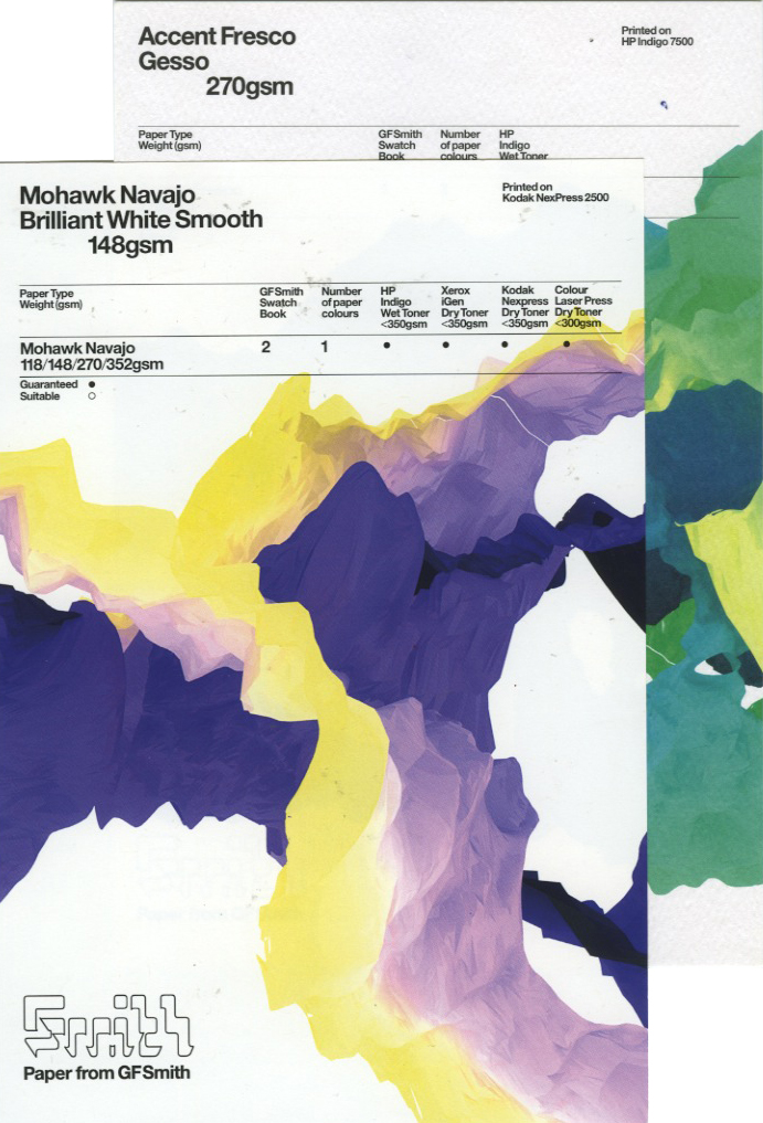
I recently acquired this lovely package. It's a collection of digital print test paper from the company GFSmith. As interesting as the stock choices were, it was more the designs on the stock that caught my attention. The design mirrors natural mountain and iceberg shapes, yet the colours do not. I love the visual aspect and versatility of colour within the consistency of the design. It is a visually engaging way to advertise stock, one that forces attention.

Here i've taken inspiration from the shape of this design and adapted it into my project. It relates because it is similar to soundwaves- i find the shapes inspiring because of their flowing lines.

Subscribe to:
Posts (Atom)