Monsters Inc intro:
Tuesday 29 November 2011
Monday 28 November 2011
Type & Layout
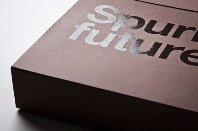
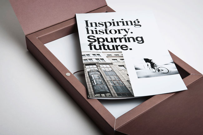
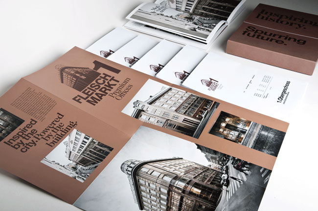
Am Fleischmarkt 1
Moodley Brand Identity.
'Since the middle ages “Am Fleischmarkt 1” has always been a remarkable business address in Vienna. In 1909 a beautiful Art Nouveau edifice was built there — in terms of construction a real visionary building, because for the first time, reinforced concrete pillars, were used.
At the moment, the building is being revitalized in order to create new high-end business offices keeping true to its original style. The address branding that moodley brand identity was assigned to create should symbolize the inspiring history (the beautiful historical building itself) as well as the spurring future (high-end applications go together with an extreme high environmental compatibility).
Design decisions
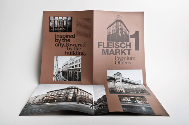
The graphical identity of the building is influenced by the special architecture and its copper colours. A folder produced in larger edition is used as a pre-sale promotional item. A limited edition of a marketing box (containing floor plans, detailed descriptions of amenities, etc.) and a high quality image book not only describe the innovative interior design and the ecological benchmarks of the new building but also Vienna in general as a A1 business location.'

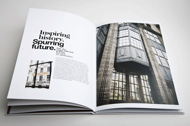
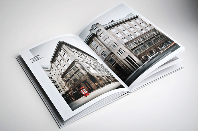
Simple layout. Firstly, there is a strong sense of direction within this spread. The two images reflect each other- geometric shapes are present and used to their potential. The image on the left leaf uses dark directional lines to push the focus onto the type. The type is surrounded by a lot of negative space, and the use of an image taking up all available space on the opposing leaf gives a lot of importance to this text.

I personally dislike widowed type- unless you want the viewer to read it in a fragmented way. However, the use of an image covering both pages, with type in an obvious but unimposing place gives power and impact, whilst the colour scheme connotes more of a pure feel.


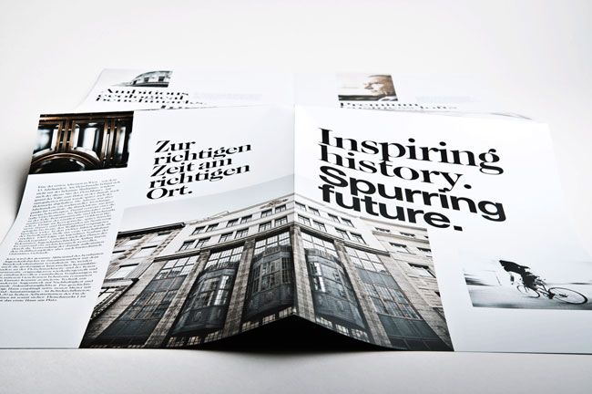
The type for the title seems too close together- i'm not sure whether this was a purposeful decision or not (I think it maybe was). However, I personally dislike it. There seems to be a lot of room to breathe in reference to this design when looking at the type and layout. But for the title it seems incorrect to me. I feel there could have been slight more spacing between 'Inspiring' and 'history' then 'history' and 'spurring', and also between 'spurring' and 'future'. The bottom of the p against the top of the t looks far too close- the history looks claustrophobic because of the lack of negative space. Though I do think this was purposeful as the same method has been adopted for the majority of title type within the design.

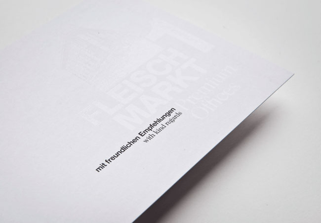
White on white, black on black- I love the delicate feel this has been given. You wouldn't notice it unless you took the time to look at the design.
'All used materials are made of high quality paper with many special print refinements.
Credits
Client: Amisola AG
Strategic advice creative & art direction: Gerd Schicketanz
Graphic design: Katharina Hölzl
Text concepts: Michael Endlicher
Photography: Andreas Balon, gregortitze.com
Production: Alanova Druckerei GmbH
Web: muevo (www.fleischmarkt1.at)
Product photography: Marion Luttenberger'
Client: Amisola AG
Strategic advice creative & art direction: Gerd Schicketanz
Graphic design: Katharina Hölzl
Text concepts: Michael Endlicher
Photography: Andreas Balon, gregortitze.com
Production: Alanova Druckerei GmbH
Web: muevo (www.fleischmarkt1.at)
Product photography: Marion Luttenberger'


Friday 25 November 2011
A couple of books...

| Hillner, M, 2009, Virtual Typography, AVA Publishing |

| Zwick, C. , Schmitz, B, 2003, Digital Colour for the internet and other media. |
A few books to read before I get going with the digital module.
Monday 21 November 2011
The Nice people at Welcome, Skate store, Leeds.


Whilst taking these images, I had to keep in mind my project, and what would work where. The store wasn't exactly what I was looking for, but it was close enough for me to work with the images and not ruin the concept.


If my Photoshop skills/ general patience are up to it I thought I could try editing the logo onto the sleeves of these tees.


Important to think about what different contexts the identity can be seen. For example, in a changing room on a mirror could be a sticker, small or big. There is the possibility of vinyls all over the walls, or patterned curtains on the changing rooms.


The last two images are more for me to explore whether my vinyl from the floor to the walls could work as a proposal through photoshop, rather than the real thing. I was hoping to get an image of a long white room with a white wall at the back, however, it isn't so easy when shots have been designed to look good, not blank canvases.
After many unfortunate attempts of taking images inside clothing stores that would suit my brand I went down to Welcome, and the lovely people gave me permission, finally.
Sunday 20 November 2011
Production for Print, Colour for Print. Spot Colours.
Spot Colours within Print.
Package and promotion:
Baileys.

A total of 7 spot colours are used in Baileys label, this isn't including process colours either. An interesting fact from our print visit to Duffield in Leeds. It is clear to see when you look at it against other cheaper imitation brands that Baileys has the richest, deepest colour range. This adds authenticity and quality to the product and heightens its brand identity because it is so hard to copy. Most imitation brands would never use this many spot colours because it is just too uneconomical. When they are trying to compete against leading brands they have to cut costs- in the pricing area.
Galaxy.

Galaxy chocolate packaging uses at least two spot colours to add depth to their packaging. The colours are rich and unachieveable through CMYK. When brands use spot colours for their packaging it gives them an edge. One of the first things the audience will see are the colours of a product. And if the product has colours the audience aren't used to seeing, it will be more likely that they will pay attention to it.
Publishing and Editorial:
Croatian designers Bruketa&Žinić have created a book that can only be identified in the dark.


After looking through every link I could find i've still yet to come to a definite conclusion on how this book was created, however, I have a theory. I think that the glow in the dark aspect of this book was printed using a glow in the dark ink- a spot colour. A reasonable thought. I can't think of another way in which a mass produced product would be economical to be printed. In all, this is an inventive use of spot colours, one that not only looks amazing, but also reflects the concept- there is a reason for this print process being used.
Leaflet/exhibition promo printed by Generation Press for the V&A: Postmodernism

Fluorescent colours cannot be created using process colours, they have to be a spot colour. Again, the use of this spot colour has deepened the concept whilst also giving a great looking finish. Fluorescent colours catch the eye, and if used correctly can look great.
Branding and Identity:
D&AD.

D&AD (along with nearly every brand) have a colour that is associated with their brand because of how consistently it is used. This memorable yellow is created using a spot colour. The simplicity of their colour scheme ensures a memorable brand- Yellow/ Black/ White are the main colours D&AD use within their designs.
BOSKKE
Contributed by Mason Wells of London-based Bibliothèque.
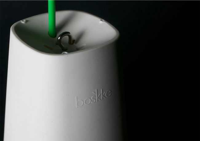
Boskke Sky Planter recycled
An identity, brand positioning and packaging project for the innovative, gardening focused, lifestyle company Boskke.
The new logotype is reflective of the unique position that Boskke
occupy in their market, whilst being grounded and relevant to their
product. The idiosyncratic double ‘K’ letter-forms in the name are
modified to create a visual link to plant growth.
The project includes full implementation of the identity across all
product packaging, installation guides, point-of-sale, marketing and
brand materials.

Boskke products

Sky Planter box

Wall mount

Extension wire

Sky Planter instructions

Multi-language instructions
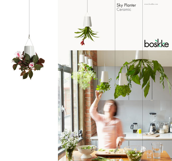
Product brochure

POS poster

POS swing tags

It is very hard to tell just by looking at the screen, but i'm quite sure this branding for Boskke has used spot colour. The turquoise colour is rich and bright, moreso than process colours could produce. However, it is a possibility that this colour has been created through the process colours cyan and yellow.
Information and Wayfinding:
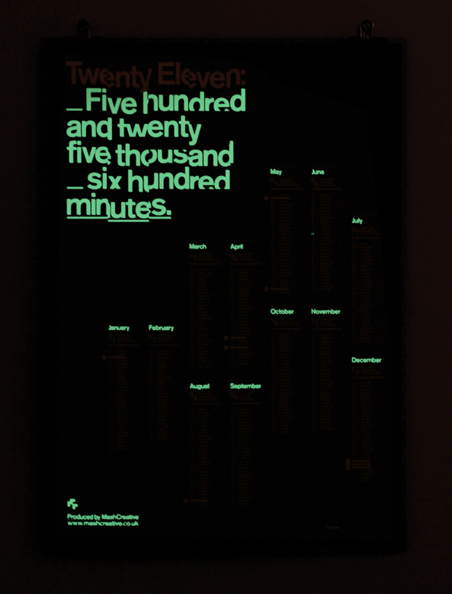
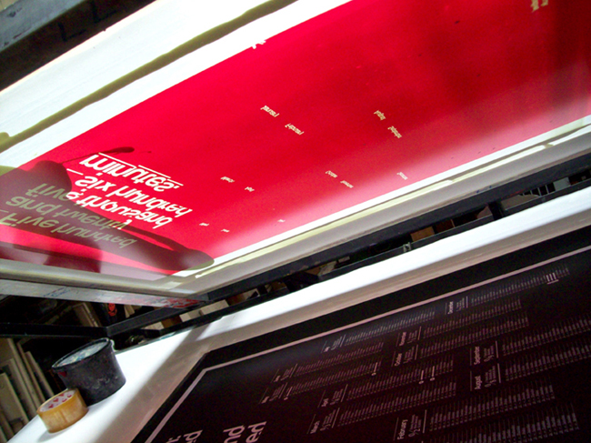
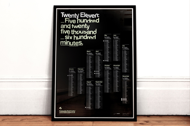
Mash Creative 2011 calendar. Contributed by Mark Bloom, creative director at Mash Creative.

A limited edition print of 100 x A1 calendar posters, the Mash
Creative 2011 ‘minutes’ calendar is the second in a series of three
posters and an evolution from last year’s successful 2010 ‘seconds’
calendar.
Thought process
The human race seems to be obsessed with time, it’s the one thing we never seem to have enough of. The year ‘Twenty Eleven’ (2011) is made up of five hundred and twenty five thousand, six hundred minutes, that’s an average of around forty-three thousand, eight hundred minutes a month. Our calendar has been designed to be a typographic representation of the year, each month has been broken down into minutes which have been listed below each month name. The jumbled title text at the top of the poster continues the theme from last years calendar and has been influenced by old analogue flip clocks.
The human race seems to be obsessed with time, it’s the one thing we never seem to have enough of. The year ‘Twenty Eleven’ (2011) is made up of five hundred and twenty five thousand, six hundred minutes, that’s an average of around forty-three thousand, eight hundred minutes a month. Our calendar has been designed to be a typographic representation of the year, each month has been broken down into minutes which have been listed below each month name. The jumbled title text at the top of the poster continues the theme from last years calendar and has been influenced by old analogue flip clocks.
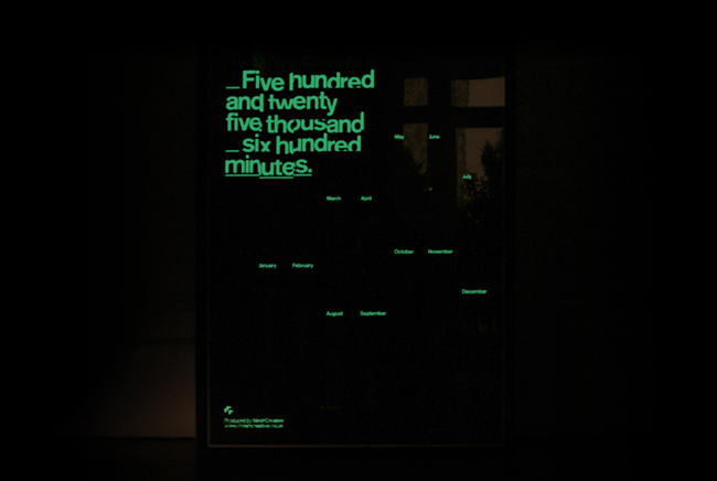

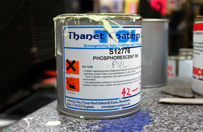
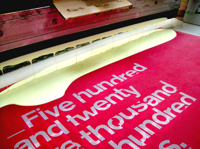
The calendar has been printed with phosphorescent ink allowing the
design to take on a completely different look at night. Using the idea
of sidereal time (star time) the highlighted months glow like a
constellation of stars.

Expertly screen printed by Bob Eight Pop
— each poster has been printed in white and phosphorescent ink (for
24-hour visual appeal) and printed onto high quality 160gsm Raven Black
Kaskad. Each poster is hand numbered and signed by the designer.
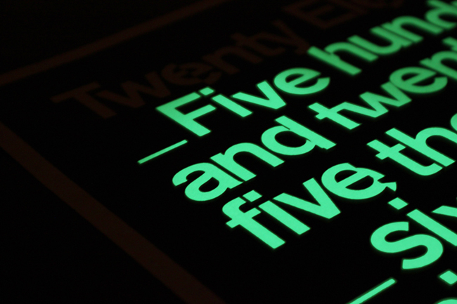


Wow. I love this calendar. Again, glow in the dark- but still, very unique design applied to a good concept. Bot work well together and go hand-in-hand.
Beautiful layout in the dark as well as the light.
Also, I think this may answer my earlier connundrum of how the 'Good ideas glow in the dark' book was printed- PHOSPHORESCENT ink. Perhaps?
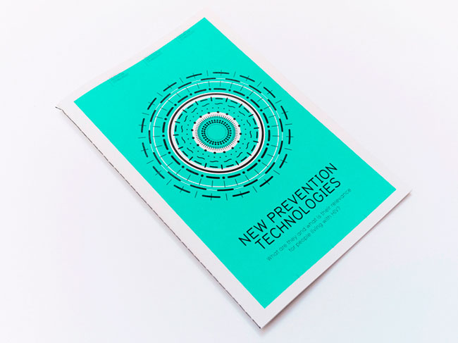
NPT, Contributed by Leon Dijkstra of Amsterdam-based COOEE.
GNP+ is the global
network for and by people living with HIV. As a network of networks
they are driven by the needs of people living with HIV worldwide. Based
on emancipation and self-determination, GNP+ works with independent and
autonomous networks regional and national in all continents.
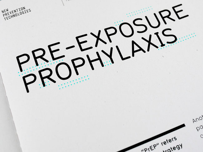
New Prevention Technologies (NPT)
is a division of GNP+ that supports research and development of any
health related technology, drug resistance, testing and access as well
as other ethical issues, especially for people living with HIV.
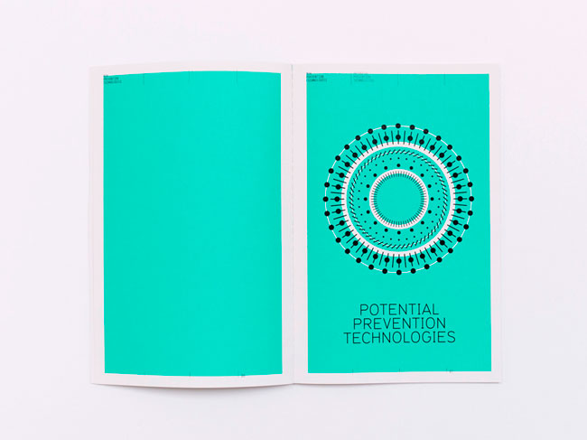
Every prevention technology has been visually translated into
different stroke styles to become the foundation for this identity. Each
stroke is representing a different layer of prevention and can be
combined in many different ways, creating a new, unique image. In the
future more techniques will be developed so this identity is constructed
in a way to support future extensions.
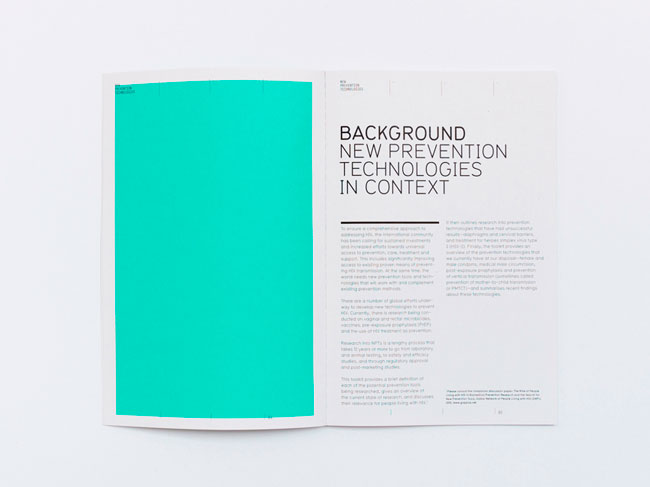
In the booklet the significance of this identity becomes more clear
because each chapter contains a combined image, made out of layers and
summarises its content. The image on the cover is a combination of all
chapters.
Instead of creating a static identity with assigned restrictions,
COOEE created a design system – like a toolkit — that can grow along
with the organisation. It’s an identity with a design result that’s
content driven, has got a consistent base and is still flexible.
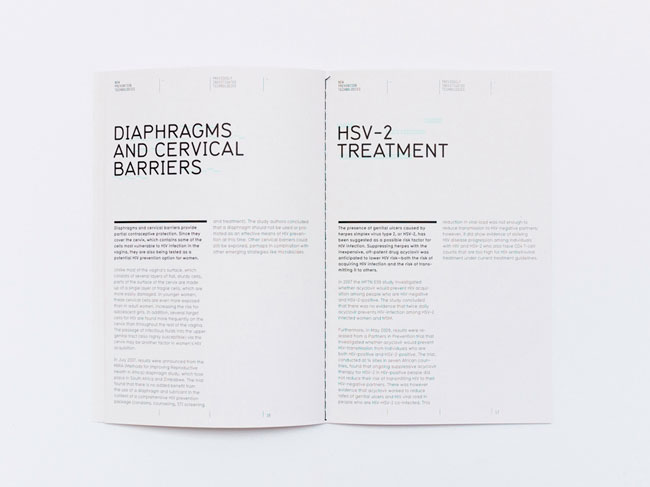
I personally think the colour used here is too much. When used in small areas such as behind the headers of text the spot colour comes into its own, adding a little more 'design' to the information.
Subscribe to:
Posts (Atom)