Sunday 22 May 2011

Speaking from experience

DRY


Brilliant use of stock.  Bulky, recycled- connotes cheapness yet because of the quality design looks expensive.
Also- I like the shapes- well, the typography, but the use of shapes to create the type- really interesting to look at.  I would like to own one of these business cards.

Packaging:
 Brilliant piece of package design.  Obviously the striking aspect is its shape.  But also the colours and stock used-  classy//cool.


Branding:
Euan MacKenzie.
Lovelly.  
It's all about creating something memorable.  That's the rule me and Sadie have been following for the branding of our 'Make the Most of it' project.

Finishing touch:
Wax Seal?

Would look amazing.  
If we could pull it off.
 -Something to think about!  -could increase the quality of the final resolution. 

Friday 6 May 2011

Speaking from experience, print processes


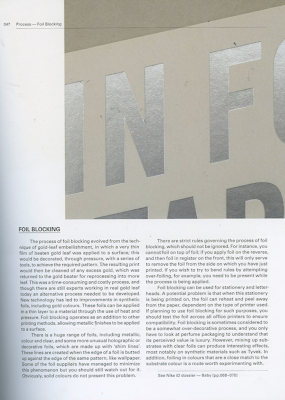
I have obtained this information from the book:


Monday 2 May 2011

Speaking from experience, print processes


Detail, A Bigger Splash poster by Sam Ashby, printed by Manymono


With Risographic printing fever in full swing, Grafik interviews Riso pioneer Hugh Frost, founder of Landfill Editions and Manymono. See Grafik issue 189 for a special feature on publishing’s current state of health.
Grafik: How did Manymono get started?
Hugh Frost: I first saw the machines at Extrapool in Holland in 2007 and later bought a cheap one on eBay to print a group of comic projects and some of my own work. I started Landfill Editions to release these prints and books but got carried away with the idea of offering a print service to pay for materials for the machine, so Manymono became a bigger project than initially intended.
G: What kind of projects do you print?
HF: I generally focus on single sheet work like posters, art prints, postcards, record sleeve inserts, but do print some zine and book projects as well.
G: What is the beauty of Riso printing?
HF: The bold colour palette, the bad registration, the chalky feel heavy ink coverage has, building images up step by step and being surprised by unexpected overprinting results. Also, the chipmunk-in-a-running-wheel animation in the control panel.
G: What’s the most challenging thing you’ve printed?
HF: I always find wedding invites the most daunting and worry about ruining a perfectionist couple’s wedding with bad registration.

Speaking from experience, print processes

Foil blocking

Foil blocking has been developed using the letterpress principle. A male block is produced using zinc, magnesium, copper or brass. These are process engraved.
The block is heated on press and a metallic or coloured foil is branded on to the material. Foiled logos are incorporated into many corporate identities, used especially on corporate invitations, business cards, letter headings and compliment slips.

I found this site that displays the processes possibilities very well:


Speaking from experience, print process

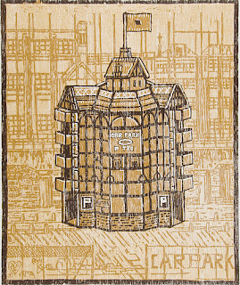
An interesting print response to Shakespeare:

Alongside their latest batch of plays, the RSC are staging Folio: an exhibition of Shakespeare-inspired prints from the Royal College of Art. Back in 1964, the college’s Printmaking Department produced a series of lithographs to celebrate the playwright’s quatro-centenary. Original prints from this series will be exhibited, as well as newer works by guest artists, students and staff at the RCA.


Bernard Cheese – Shakespeare’s Kings, lithograph, 1964.


Justyna Kabala, Lady Macbeth, photo lithograph (2011).  


Joe Tilson – Shakespeare’s XV Sonnet, lithograph, 1964.


Adam Dant – The Theatre, Shoreditch, three-colour chiaroscuro woodcut, 2010.


Eleanor Lines, All that Glisters is not Gold, screenprint and photo lithograph (2011).

A link to the article:

InDesign, existing layout examples.


The majority of these layouts are focused on a person/people.  This is the most relevant because my article will be based on someone else.  I am looking for common similarities that can be adapted into my work.  I am also looking for interesting and innovative ways of presenting this information that I can take inspiration from.
For example, the second image down focuses on the person entirely.  The image spreads across a double page with a small amount of text over it.  This straight away captures your attention, and holds a lot of impact- depending on the tone of the article this could work well- reflecting the bold nature of my partners personality.


For me the article above is littered with images, it is crowded and confusing.  The general feel is dull yet busy.  One aspect I can take from this article is the colour scheme- it works well in capturing the viewers attention, and holds an exciting feel- I need to remember that colour scheme can also affect the tone of an article before someone has even read it.


All of the articles above are from the same magazine 'Pop'.  This is more the feel I think i'll be going for.  It's something in which I can imagine my partner (Luis) in.  The feel is more structured with interesting imagery- the structured aspect is one that reflects Luis' personality, everything has to be organised and structured.  I specifically like the overlay of a small, light pointsize type on the image, with different weights creating an interesting texture from a distance.


The articles above all come from the illustration magazine 'Varoom'.  They all possess high quality layouts using different typefaces, colours, shapes of text and weighting- giving some really interesting finishes.  The different typefaces coupled with their size means that focus is on different areas- I can use this to my advantage when designing Luis' article- focusing on a small amount of text that sums up its tone.


The two articles above are from the French culture magazine 'Numero'.  They have money to spend on layout here, making use of space, these articles looks as if they come form an expensive magazine.  I particularly like the second article- the mass of space draws you in.


The article above is from 'The Times' supplement: 'Eureka'.  Here, there is a lot of information crammed on one page.  It is regimented yet also busy.


I need to think about different weighting within the article- how it, in a subheading or sentence can create different levels of focus and thus change its tone.  It also looks more visually interesting and diverse- rather than solid weighting within the whole thing.