Monday 31 October 2011

Wellcome Collection, London


Wellcome Collection is a free visitor destination for the incurably curious. Located at 183 Euston Road, London, it explores the connections between medicine, life and art in the past, present and future. The venue offers visitors contemporary and historic exhibitions and collections, lively public events, the world-renowned Wellcome Library, a cafĂ©, a bookshop and conference facilities. 


“It seems that the soul... loses itself in itself when shaken and disturbed unless given something to grasp on to; and so we must always provide it with an object to butt up against and to act upon.” Michel de Montaigne, 'Essais', 1580
 
'This exhibition was one of the two in the museum.  Focusing on humans emotional attatchment to objects that supposedly have some power behind them, that has the potential to influence their lives in some way.'

'Amulets have appeared throughout history and across many cultures in an infinite variety of forms. Each has been invested with the hope or belief that it could somehow mediate on behalf of its owner. They are tiny embodiments of the anxieties we feel about our human frailties, their assumed powers often drawing on the dark arts of superstition and magic.'
Unfortunately photography of any kind was not permitted so I have raided the websites online gallery to give a visual representation of what I saw.
"The widespread wearing of red coral is for life and health, by its colour sympathy with blood." Edward Lovett, 'Magic in Modern London', p. 79

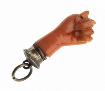
Lower jaw of a small animal with silver mount and suspension chain. Used as an amulet.


"I do not know of any object which for its size enjoys such a reputation as the acorn. I do not allude so much to the natural object, which when ripe falls from the cup and thus loses its character. I refer to the acorn design, which is so widely met with and made in so many different 
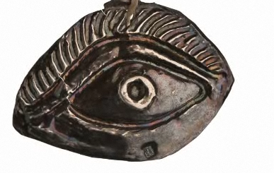
materials." Edward Lovett, 'Magic in Modern London', p. 63.     Carved horn acorn in two pieces, containing a bell. Used as an amulet against lightning.


 Collection of Medicinal Product Packaging revolving around the subject matter of insects.


Annie Cattreil
SENSE, 2001-03


'This sequence of sculptures illustrates the activity patterns of the human brain as it responds to the five senses: touch, smell, sight, hearing and taste. Scans of a subject's brain using each of the senses were produced with functional magnetic resonance imaging. These scans were then converted into three-dimensional physical structures of amber resin using a rapid-prototyping process. The elegant simplicity of the sculptures belies the complexity of the technology required to make them.'

This sculpture sequence is a visual representation of the exploration of the five human senses within the brain.  The patterns the responses have create are the aspect that intrigues me the most.  From a visual design aspect, this is the kind of work I always come back to, and can see myself being inspired by it in future projects.


Saturday 29 October 2011

Branding.

With a focus on clothing branding:

A collection of clothing brands that I feel would be in the same area as my company.  This is the audience I am designing for.


Drop City.
In the early 1960’s a man by the name of Buckminster Fuller (1895-1983) was known for designing geodesic domes, which used minimal resources while creating a maximum interior space. He was an inventor, poet, philosopher, mathematician, architect and engineer. Fuller urged people to think globally and act conscientiously to better mankind through a “design revolution”. His legacy has inspired artists, engineers and thinkers around the world.
In 1965 an artist commune in Colorado known as Drop City was created using many of Buckminster Fuller’s architectural and philosophical ideals. Drop City was to function in a “synergetic” interaction between peers to create experimental artistic innovation.
COMUNE has launched its’ own “Drop City” gallery. Housed in a structure of recycled steel shipping containers, the space is inspired by the original drop city artist commune in the early 60’s, and brainchild of COMUNE Art Director, Corey Smith.
Drop City was introduced to attract like–minded creative people to the COMUNE artist community and collaboarte on special projects through COMUNE’s clothing brand. With participating artists including Andrew Kuykendall, Krystal South, Noah and Nathan Rice, Ray Gordon, Noel Sinclair Boyt, Wyatt Hull, Devendra Banhart, Mario Wagner, Alana Paterson, Beth Hoeckel, Bryan Schnelle, and Amber and Ashlie Chavez over time Drop City will continue to evolve its’ community, creative platform and influence.


Negative space.


I personally dislike this logo.  The bear in the counter of the 'p' looks untidy and confusing from a distance.  However, when it is on its own it takes it is taken away from type and works well purely as an image.
Think about stock applications.  Especially for clothing branding, has to be suitable for other materials.


The logo which has defined the brand started in the early 1980s after Shawn Stussy began scrawling his surname on his handcrafted surfboards with a broad tipped marker.[2] He began using the logo on T-shirts, shorts and caps that he sold out of his car around Laguna Beach, California.[3][4]
In 1984, Stussy and his friend, Frank Sinatra Jr.(not the singer), partnered to sell the apparel. The company expanded to Europe by 1988 and later opened a boutique store in SoHo, New York. The brand continued to open successful locations throughout the 1990s.[2] It was reported that revenues reached $17 million in 1991[4] and $20 million in 1992.[5] By 1992, the brand was sold throughout the United states at specialty boutiques and department stores alongside other high-priced "California lifestyle" clothing. Outside of the country, the brand was found in specialty shops alongside clothing from high-end international designers.[6]
In 1996, Stussy resigned as president of the company and Sinatra bought his share of the company holdings.[2] According to the company's website, the brand is available in company branded stores and other retailers in Europe, Asia, the United States, Canada and Australia.  Source.

Important to think about not only the logo but things that come along with the identity and branding of a company, i.e, labels and bags- packaging.

Miller & Green.
Nice touch for a simple back.  Heightens the feeling of luxury whilst injecting another colour into the packaging.


Friday 21 October 2011

Stock options and Print finishing

Stock options & Print finishing.


Branding and Identity:


Outside Photographic.
Contributed by London-based art director Andreas Neophytou.
Outside Photographic
Outside Photographic is a photographic agency based in London. Its clients range from fashion to music, working with brands such as Jaeger, Nicole Farhi, GQ, Wondrland Magazine, EMI, Mercury Records and Warner Records.
Heavy gsm black stock.  Foil blocking embossing.  Not sure exactly how the white ink was printed, UV litho, but difficult to tell.  Unless it was just white foil.  Perhaps it was created through white foil.

Antarctic Voice.  Contributed by Slava Kirilenko of Kazakstan-based Astronaut Design.

Antarctic Voice
Antarctic Voice is a project that aims to express the voice, the silence and the magic of the unattainable continent, Antarctica.
Antarctic Voice
Antarctic Voice
Antarctic Voice
Antarctic Voice
Antarctic Voice
Antarctic Voice


Beeswax Candle. 


Matt Heavy gsm stock.  The logo is heavy and reliable, much like the stock used- the concept is full circle.


Packaging and Promotion:

Leeds poster stands.
These poster stands in Leeds are perfect promotion for upcoming gigs and openings.  They are everywhere.  In my opinion they are very effective, more than once i've found myself stopping in front of a poster to see what the event is.  A durable, preferably glossy stock is used on these stands to retain quality through different weather conditions.  There is also a paste over them to heighten durability.  A lot of prints tend to be one/two colours plus stock.  This is to keep down costs and also give impact- if a poster looks simple the viewer will take in the information.  I should keep this point in mind when designing for an audience who are more likely to be walking past rather than stopping to appreciate the design of the poster.


Promotional poster for London based graphic design agency 'DRY'.  A heavy black stock has been used, with what I think is screenprinted over black white image, then with gold foiling on top of all that.  Unfortunately there is no information of the context of this poster.  I don't know what size it is or where it is designed to be seen.  I know it works in getting my attention.


Publishing and Editorial:


FRAME magazine.  For their latest issue, foil block was used to give a feel of luxury that reflected the subject matter of the main story within.  The foil blocking against the matt stock gives an expensive feel with a textured look.

Three days + 16 illustrators = 3,750 drawings.  CRIllustration, Magazine / Newspaper


Each cover of TQ comes from a different part of the original drawing.

Close-up of the grid
"We mapped out the overall canvas on the floor of the warehouse, but didn't show any of the illustrators the actual borders of each cover,""We just tried to maintain even coverage overall, safe in the knowledge that the covers would kind of choose themselves, rather than us choosing them."


The full poster insert showing thumbnails of 2,500 individual cover sections


The illustrators who worked on the project were Ryan Chapman, Jasper Dunk, Dale Edwin Murray, Daniel Frost, Matthew Hams, Yasmeen Ismail, Jean Jullien, Chetan Kumar, Paul Layzell, Maggie Li, Dominic Owen, Hattie Stewart, Toby Triumph, Robbie Wilkinson, Paul Willoughby, and Dan Woodger.


Information and Wayfinding:


Tomlinson Tap Room

Contributed by Isaac Arthur of Indianapolis-based CODO Design.
Tomlinson Tap Room
Tomlinson Tap Room

Experience specifics

After the identity system was finished, we carried the identity through to wooden nickels (street team pieces redeemable for beer samples), coasters, pint glasses and growlers, t-shirts and the social media presence.
Signage is a challenge due to limitations on what we can and can’t do within the historic space. No drilling, hammering or gluing presents an annoying challenge. Our solution was a mobile pint-glass-shaped sign that carries the Tomlinson identity out onto the street in front of the city market.
Tomlinson Tap Room
The back bar itself was sourced from a historic 1920′s Hook’s Drug Store, meshing beautifully with the Tap Room’s ambiance.
One of the more celebrated promotional pieces is the Tomlinson Tap Room Passport. There are over 35 breweries in Indiana, and more opening every year. If you have a pint or growler fill from every brewery, then you become a ‘Tomlinson Regular’ getting your name placed within the bar.
Tomlinson Tap Room
Tomlinson Tap Room
Tomlinson Tap Room
Tomlinson Tap Room
Tomlinson Tap Room
Tomlinson Tap Room
Due to one color printing and a heavy deboss, we were able to create a tactile keepsake that represents huge bragging rights for beer geeks and a lot of money spent within the bar.

Extremely well executed.  One colour printing and debossing with a heavy stock is simple, bold and effective.  Though in the last image the stock seems to have cracked slightly, however, it is not entirely certain whether that is the desired effect or not.