Friday 30 September 2011

From exhibition to clothing company.

Seeing as my project is taking a turn towards promotion of an Exhibition, I knew I had to obtain some information on how different sized/of different importance exhibitions engage people.


Aztec mask
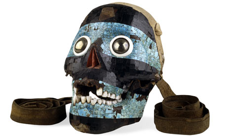
Mosaic mask of Tezcatlipoca. Aztec/Mixtec, 15th-16th century AD. © British Museum
"A sun of gold fully six feet broad and a moon of silver… all kinds of wondrous objects of various sizes. All the days of my life I have seen nothing that gladdened my heart so much," wrote Albrecht Dürer, "as these ingenious marvels of men in foreign lands.

Source.


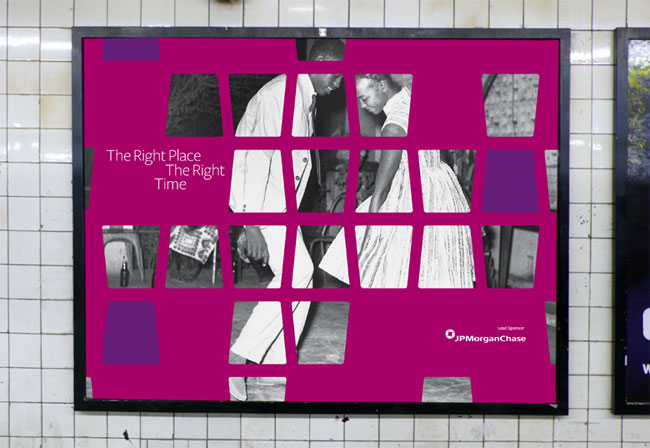
New exhibition challenges view of Aztec emperor Moctezuma as traitor

British Museum claims leader of lost civilisation died at hands of Spanish explorers, not his own followers

Montezuma at the British Museum
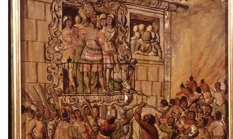
Detail from Enconchado 16, by Juan y Miguel Gonzalez, AD1698, from Moctezuma: Aztec Ruler at the British Museum. Photograph: Museo de America, Madrid
Contrary to popular belief, the Aztec emperor Moctezuma was murdered by his Spanish captors and not by his own people, the British Museum will argue in a new exhibition that will try to rehabilitate the emperor's image as a traitor.
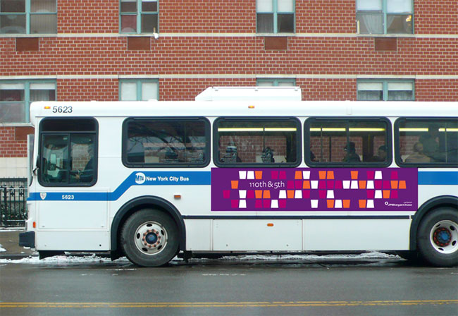
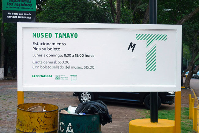
Identity for the British Museum Exhibition.

Shows how exhibitions can have a tone of voice which persuades people to think a certain way.


I wanted to look at the devices within the museum that attract peoples attention, for example, In one of the first  Exhibitions a life-size hologram was used as a timeline.  You have to interact with it to find something out. The dark environment, mixed with the backlit boards stand out.


The image below depicts an educational device that forces the viewer to interact to get some form of answer.


Apart from the above noted, there wasn't much else to note.  It seemed to me that a lot of the pieces spoke for themselves and had enough of an impact without having to force people to engage.  i think that perhaps the area I should be focusing on moreso is the promotion of an exhibition through large scale posters; booklets; mailshots etc.


Perhaps I need to think of a more inventive approach to educating people about the Aztecs.  Although an exhibition offers a chance to use print processes to their potential I don't think that it is the most interesting angle for me to come from, it is clear that this has been done before and I don't want to just regurgitate existing work.


From my design practice it is clear that I have found that approach- a clothing company.  I came up with this idea whilst looking online for some new clothes.  I realised so many clothes, male/ female; old/young; cheap/ expensive, use aztec imagery.  Whether it is just a simple pattern with colours to match, or elaborate vests that mimmic the materials of the time.


With the facts and figures I have collected, it would be a successful area to investigate further into.


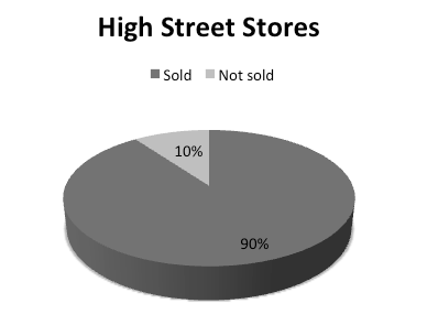
From a survey of 100 people I asked:


This is approximate, however I have found that:
The majority of high street stores sold some form of aztec inspired clothing.  This was quite a shock, and is not to say that it is definitely Aztec inspired, however from my research it looks to be so.  For these figures I have looked at shops such as Urban Outfitters; Topshop/Topman; M&S; H&M and so many more.  These figures are approx.


So, from the 68% that said they did own aztec inspired clothing I asked:

And from the same people I asked:

It seems natural for me to go into a clothing company that educates people on Aztec imagery/culture.  I was very surprised at all of my results.  I now just need to think about exactly how I intend on educating people.

Tuesday 27 September 2011

Design for Print

Design for Print:

Branding and Identity:

Design Museum/ Wim Crouwell.
At the beginning of the summer I went to the Design Museum in London and saw Wim Crouwel- A Graphic Odyssey.  The exhibition was a retrospective of his work, which included a range of disciplines- one of which being a large selection of his branding/logo designs.


Matthew Hilton.
'Matthew Hilton is one of the most important and influential modern furniture designers in the UK, having established his reputation working for the likes of Habitat, SCP and Case. This identity was designed to support the launch of his own critically acclaimed personal range of furniture. The bold nature of the marque reflects his strong 
idiosyncratic vision.'  Sourced: http://spin.co.uk/work-by-discipline/identity/matthew-hilton


I love the simplicity of this logo and the aspects it has been applied to.  Works well in monochrome.

Museum for African Art.  Contributed by Bobby Martin of New York-based OCDSource.

Museum for African Art brand identity design
During construction, the Museum for African Art (MFAA) wanted to conceal the work in progress, while teasing what’s to come and allowing full access to the public space near Duke Ellington Circle, as well as preserve the views of the park from the interior. Even under construction, the sight line from the second floor to the Harlem Meer was not to be missed.
Museum for African Art brand identity design
Robert A. M. Stern developed a window pattern based on African textiles and domiciles. To conceal without concealing, OCD layered on a second, third and fourth application of African patterning. These were translated into the MFAA brand colors and modernized a bit. The effect is a peek-a-boo teaser that lets the light shine in and out.
Museum for African Art brand identity design
The AfriSans typeface is the core of the MFAA identity system. Inspired by the building’s architecture, each letterform locks into the figures around it. To build a fully integrated system, every letterform had to be drawn and programmed twice: opening up and opening down. Each headline makes a uniquely Museum for African Art tesselating statement.
AfriSans Light
AfriSans Medium
AfriSans Black
Museum for African Art brand identity design
Fall Benefit & Silent Auction, invitation system
Museum for African Art brand identity design
Capital Campaign, customisable consistency
AfriSans
Museum for African Art brand identity design
Design: Jennifer Kinon, Bobby C. Martin Jr.
Typography: Jesse Ragan
Photography: Ari Burling

It had to be colourful if it was going to be for African art.  I think this whole project has been executed beautifully, especially the invitations- the colour type over the block colour packaging works extremely well, whilst the skinny type pushes the design into the 'current'.

Ink Copywriters.  Contributed by Sophie Eyles of Bath-based Mytton Williams.
ink print
Witty wordplay to introduce those who play with words.
Ink, a new team of copywriters, needed to create a visual identity to launch the company. The identity had to appeal to ‘the country’s best and most cynical designers.’ It also had to be practical and affordable.
ink poster
The design solution was to focus on the words, not imagery. By using bold, witty type and allowing the copy space to breathe we were able to communicate the personality of the company and show-off its copywriting skills.
ink copywriters

ink copywriters
An exclamation mark was added to the company name to create a strong and memorable logo. We used one typeface, Futura and two colours, black and grey.
The distinctive identity, personality and launch material has helped the company to rapidly establish itself and gain recognition. Having created the Ink identity, and helped communicate its quirky and individual personality, we have continued to work with the company on digital and promotional material.
The latest project has been the creation of a significantly upgraded website. This features the key aspects of enhanced SEO and further development of the brand identity and personality.

Packaging and Promotion:

Another Example.
Promotional material for Another Example:
Stark/ Contrast/


Packaging and promotion:

Promotion:
A campaign to launch the new membership scheme for the Design Museum.


Wedding invitation
Letter pressed 4 page wedding booklet/ invite and RSVP card design.  The full job was printed by hand using laser engraved metal plates by Generation Press.  I love the texture of the stock against the print.


GFSmth's extensive mailing programe helps keep Designers & Printers right up to date with new ideas, new papers, new promotions and the latest in print and production techniques:


Would also work with branding and identity.  This mail out is promoting a specific service within GFSmith, whilst branding at the same time.

'Independent British paper company GFSmith are proud to launch its new digital paper promotion named Print Test. Always keen to offer a service beyond simple duty stocks, GFSmith’s papers are at the forefront of the minds of their customers. To create visual impact, each copy of the digital Print Test promotion is unique (edition of 10,000), and the innovative process combined coding with pre-determined colour palettes, resulting in vibrant, colourful and dynamic illustrations fully embracing the dynamic digital print medium. Generative illustrations and process photography by FIELD, design by SEA.'  Sourced: http://www.itsnicethat.com/articles/gfsmith-print-test


Malibu Illustrative ltd edition:


Publishing and Editorial:
'Wallpaper* Anniversary Issue
Wallpaper* and GFSmith commissioned 15 designers to produce a bespoke cover around the concept of 'Wallpaper* Famous for 15 years'. In the true sense of bespoke, the process employed the HP Indigo digital printing system in order that each cover could be printed on a different Colorplan stock.'  


Generation press collab for Wallpaper* magazine.


I love the material that has been printed onto for this book.  Unfortunately the source is in another language so I can't find out much information on it.  However, the colour scheme is calming yet holds authority- holding your attention.  Remember simple can be a good thing!


Information and Wayfinding:


Love the type and shapes used here, along with the simple use of monochrome colour.  Important for informative design- has to be clear and readable, but also, make an impact.  

Copernicus Science Centre

Contributed by Katarzyna Maciąg of Warsaw-based Mamastudio.
Copernicus Science Centre wayfinding
The Copernicus Science Centre wayfinding system was designed to highlight the building’s architecture and its surroundings in a subtle but clear way. The designers’ task was to come up with a unique, custom-made system that would immediately create associations with the Copernicus Science Centre structure. The characteristic form of the building was used by Mamastudio as a source of inspiration. The irregular forms that were visible on architectural plans have been repeated in the shape of information modules, signs and icons. The typography used (Museo) repeats the shapes and rhythm of the icons to ensure further consistency. Associations with the Centre were additionally enhanced by the usage of the colours present in the institution’s identification system.
The Copernicus Science Centre in Warsaw is built on an open plan which means there are a few walls on which signage could be placed. Mamastudio’s solution was to create special three-dimensional and free-standing forms of whose shapes are inspired by the architecture and which are used as a source of direction. Maps and plans placed on the blocks help visitors find their way in the science centre.
Minimal use of colours, simplicity and consistency of design ensured visibility on the multi-colured background of numerous exhibitions and often changing exhibits.
The system is intuitive and easily navigable, noticeable in two languages (Polish and English) and clearly recognizable without being overwhelming or driving attention away from the exhibition.
Copernicus Science Centre wayfinding
Kopernik wayfinding
Kopernik wayfinding
Kopernik wayfinding
Kopernik wayfinding
Kopernik wayfinding
Kopernik wayfinding
Kopernik wayfinding
Kopernik wayfinding
Wayfinding system for The Copernicus Science Centre, author: Mamastudio www.mamastudio.pl
Art Direction: Magdalena Ponagajbo, art director & partner, Mamastudio
Three-dimensional forms created by Piotr Stolarski

Museo Tamayo.  Contributed by Rob Giampietro, principal at New York-based Project Projects.

Museo Tamayo brand identity
Located in Mexico City, the Museo Tamayo is a contemporary art museum that also houses at its core a collection of works by Mexican artist Rufino Tamayo.
Under its new director Sofía Hernández Chong Cuy, the Museo Tamayo has refocused its program to present a wider range of activities including programming, events, and commissioned projects.
Project Projects designed an identity for the museum and a publication system for its in-house magazine, “Rufino.” In the identity, “Museo” is signified by an angled “M” that floats within each design at different positions. The resulting identity exists in a perpetually shifting state, subverting the assumed authority of the singular, monolithic institutional identity by offering one that is responsive, dynamic, and hybrid in its place.
Museo Tamayo brand identity
Project Projects is a design studio focusing on print, identity, exhibition, and interactive work with clients in art and architecture. The studio was founded in 2004 by Prem Krishnamurthy and Adam Michaels; Rob Giampietro joined as a principal in 2010.