Wednesday, 28 March 2012

Web Design / / Interaction


User interaction with the site.  Playful.


To interact with the site, the user has to scroll up and down to show the designers collection on the model.  By scrolling up / / down, the clothes change, the model stays static.  Very relevant when thinking about a digital context whereby the screen stays in the same place, but the content changes.  This process makes for less confusion for the viewer.  Something to take note of.

Friday, 23 March 2012

Visual Direction / / Brochure

LAYOUT + TYPE

DRAWSWORDS Amsterdam:
Design Mass
Book design for a book containing essays by three theoreticians who - during the Dutch Design Week - brainstormed and developed ideas about topics such as technology and aesthetics.
Essays by Florian Schneider (DE), Koert van Mensvoort (NL) and Koen Vermeir (BE).
Published by Onomatopee.
i.c.w. Jeremy Jansen
circulation: 550
client: Onomatopee
pages: 112
printing: New Goff
size: 110 × 180 mm
technique: offset print


Visual Direction / / Gradient / / Physical application

Some really interesting colour work.  Jumps out, holds your attention.  Note: all bright, vivid colours.  Love the use of gradient and sharp colour cuts- creates interesting texture that i'm not used to seeing.  Contrast between gradient and monochrome sides increase communication with type and interest generation through isolated use of colour.
Also to mention- use of format- essentially an italic fold out.  
I.  Like.  It.


DRAWSWORDS Amsterdam
Silent Country
Poster collaboration between Jane Hardjono and Drawswords for Onomatopee's The Voice Of... project during Dutch Design Week 2011.
The posters are abstractions of Jane's memories of her homeland Australia's landscapes.
client: Onomatopee
size: A0
technique: offset print


Wednesday, 21 March 2012

GFSmith / / Colour / / Letterpress

Relationship between STOCK+INK.
Possible ticket / / mailout inspiration.


This is an interesting showcase of the relationship between ink and stock with relation to print and production.  Obviously one of the main points to our exhibition is that the target audience are designers / / printers / / graphic designers- this is design that we want to receive, and design that we should be receiving if we are to be taken seriously when it comes to the competition- 'become an expert on everything that you look into'

Promoting letterpress:
Packaged in a wax-sealed bellyband and housed in a  card folder, the five letterpresses postcards within the package feature lyrics from songs by some of Vernon's favourite Glasgow-based bands.
"Everything was printed on duplex GF Smith colorplan, except the Frightened Rabbit postcard which was printed on triplex," explains Vernon of the thick, colourful and layered stock the postcards are printed on.
Source


STOCK + INK / / Relationship

Colour Stock and Colour Ink!

I enjoy this highly.  
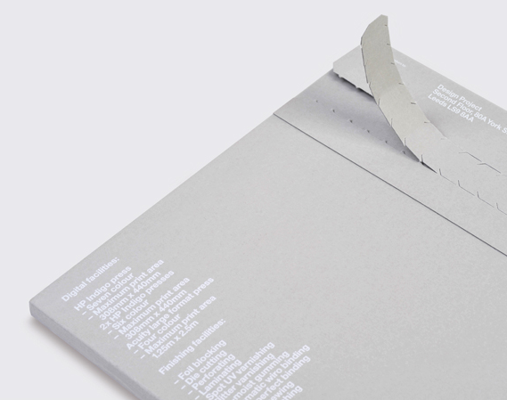
TEAM have done it again, showcasing high quality print and colour processes.  A joy to look at- if only I could get a copy and touch it / / have a sniff.  White ink has been digitally printed onto the stock- something that is becoming more and more common nowadays, and I haven;t got bored of it yet.
Further emphasises the importance of the relationship between the printer, the designer in relation to the medium used: ink + stock.  This relates entirely to our concept because it is designed with the same target audience in mind, and combines the same elements we will be combining.  Really inspiring and relevant to our project.  Essentially design for designers / / showing off - but this is has thought behind it.  In this instance, you have to get the designer interested in the product you are selling over the end viewer.  Make the promotion appeal to the audience (designers / / graphic designers) / / this then means that the designers / / printers will work with this promotion in mind / / put it forward to the client before other companies / / designed / / printed / / distributed.  - reaches end viewer. 
Team digital printing guide
The new Team digital printing guide, designed by Design Project combines our high quality digital print with a whole range of our in-house production processes. Advance demand has been extremely high, so request a copy now to make sure you don’t miss out on the highly unusual printed piece.
Printed on a range of substrates, including white gloss, grey uncoated and repositionable transparent film, the piece explores the new tactile possibilities that high-quality digital print can offer. It demonstrates process by using both full colour and digital white ink combined with foiling and duplexed stocks. The brochure is mailed in a personalised handmade printed envelope.
Source


A tactic we will have to follow.  The designer and printer clearly have much more control over stock (Fedrigoni) choice so we need to design with them in mind for our project.

Tuesday, 13 March 2012

Thursday, 8 March 2012