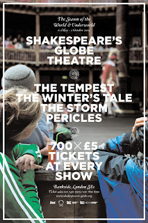
Yet another one from Graphic Thought Facility.
- including the 2003 - 2006 season leaflets.
The juxtaposition of old and new in the photography is
reflected in the colour scheme of the type.
GTF have followed the concept of old and new by adopting
a contemporary colour scheme alongside traditional type.
The imagery is also designed with a traditional hint, but had
overriding contemporary processes.
For this season, a more bold and simplistic approach
has been adopted.
This whole run has confirmed what I already know.
If you're going to use imagery (more importantly
photography) within a publication, - it has to
communicate just as much as the rest of the design.
For example, in all of these publications, the
imagery heightens and reinforces the concept
behind the design.
In short, you cannot polish a turd.
- if you use crappy imagery, the whole publication
will take a hit and you cannot escape it.


No comments:
Post a Comment