Showing posts with label Layout. Show all posts
Showing posts with label Layout. Show all posts
Thursday, 29 November 2012
Tuesday, 27 November 2012
Books Still...? - different types of 'reader'.

By using the categorisation above I am able to
truthfully assign attributes to my type and layout
that will reflect the way in which the audience read.
Rather than try and change the way people read, I want
to acknowledge that people read differenttley and
accomodate this through one grid.
HOW DO I DO THIS USING ONLY TYPE?
Visual reader:
Laconic reader:
Acute reader:

Qubik.
Heavy body copy in small columns look
challenging yet manageable.
Thursday, 1 November 2012
Riso possibilities
Stuart Geddes
'A head full of snakes.'


This publication exploits the printing possibilities
of Riso on the same stock. For example, you can
see colour separation photographic images, duotone,
overlays- purely text and purely image. There are a lot
of different aspects that will go on to inform our
experimentation with this process. I. Am. Excited.
'Museums Press', Glasgow
- A good example of colour manipulation through
differentiating stock.
Alternately, below is simple monochromatic print
with a side of coloured stock. This application
really works in assigning structure to a fairly
free image. Something to remember for future
designs.
When considering this option it is important to
remember that the coloured stock may end up costing
more than just adding another colour to the print.


Wednesday, 24 October 2012
Contemporary publication design


'Inventario is not a magazine, Inventario is not a book.
Inventario is a new editorial initiative, casting a free-
thinking eye over the design- scene.'


Tuesday, 23 October 2012


Wednesday, 17 October 2012
Traditional publication design
The ISTD brief I have chosen - 'Books still?' - requires
a solid, informed approach that means I need to research
a hell of a lot. Which is good because that was my plan
for this year anyway.

a solid, informed approach that means I need to research
a hell of a lot. Which is good because that was my plan
for this year anyway.
The process of publishing
Book and magazine publishers spend a lot of their time buying or commissioning copy; newspaper publishers, by contrast, usually hire their own staff to produce copy, although they may also employ freelance journalists, called stringers. At a small press, it is possible to survive by relying entirely on commissioned material. But as activity increases, the need for works may outstrip the publisher's established circle of writers.
For works written independently of the publisher, writers often first submit a query letter or proposal directly to a literary agent or to a publisher. Submissions sent directly to a publisher are referred to as unsolicited submissions, and the majority come from previously unpublished authors. If the publisher accepts unsolicited manuscripts, then the manuscript is placed in the slush pile, which publisher's readers sift through to identify manuscripts of sufficient quality or revenue potential to be referred to acquisitions editors for review. The acquisitions editors send their choices to the editorial staff. The time and number of people involved in the process is dependent on the size of the publishing company, with larger companies having more degrees of assessment between unsolicited submission and publication. Unsolicited submissions have a very low rate of acceptance, with some sources estimating that publishers ultimately choose about three out of every ten thousand unsolicited manuscripts they receive.[1]
Established authors are often represented by a literary agent to market their work to publishers and negotiate contracts. Literary agents take a percentage of author earnings (varying between 10 to 15 per cent) to pay for their services.
Some writers follow a non-standard route to publication. For example, this may include bloggers who have attracted large readerships producing a book based on their websites, books based on Internet memes, instant "celebrities" such as Joe the Plumber, retiring sports figures and in general anyone whom a publisher feels could produce a marketable book. Such books often employ the services of a ghostwriter.
For a submission to reach publication it must be championed by an editor or publisher who must work to convince other staff of the need to publish a particular title. An editor who discovers or champions a book that subsequently becomes a best-seller may find their own reputation enhanced as a result of their success.
[edit]Acceptance and negotiation
Once a work is accepted, commissioning editors negotiate the purchase of intellectual property rights and agree on royalty rates.
The authors of traditional printed materials typically sell exclusive territorial intellectual property rights that match the list of countries in which distribution is proposed (i.e. the rights match the legal systems under which copyright protections can be enforced). In the case of books, the publisher and writer must also agree on the intended formats of publication — mass-market paperback, "trade" paperback and hardback are the most common options.
The situation is slightly more complex, if electronic formatting is to be used. Where distribution is to be by CD-ROM or other physical media, there is no reason to treat this form differently from a paper format, and a national copyright is an acceptable approach. But the possibility of Internet download without the ability to restrict physical distribution within national boundaries presents legal problems that are usually solved by selling language or translation rights rather than national rights. Thus, Internet access across the European Union is relatively open because of the laws forbidding discrimination based on nationality, but the fact of publication in, say, France, limits the target market to those who read French.
Having agreed on the scope of the publication and the formats, the parties in a book agreement must then agree on royalty rates, the percentage of the gross retail price that will be paid to the author, and the advance payment. This is difficult because the publisher must estimate the potential sales in each market and balance projected revenue against production costs. Royalties usually range between 10-12% of recommended retail price. An advance is usually 1/3 of first print run total royalties. For example, if a book has a print run of 5000 copies and will be sold at $14.95 and the author is to receive 10% royalties, the total sum payable to the author if all copies are sold is $7475 (10% x $14.95 x 5000). The advance in this instance would roughly be $2490. Advances vary greatly between books, with established authors commanding large advances.
[edit]Pre-production stages
Although listed as distinct stages, parts of these occur concurrently. As editing of text progresses, front cover design and initial layout takes place and sales and marketing of the book begins.
- Editorial stage
- Design stage
- Sales and marketing stage
[edit]Printing
That's the Wiki version.
Here's a book with a little more insight:
Publishing, Principles & Practice by Richard Guthrie

Sunday, 30 September 2012


Monday, 28 November 2011
Type & Layout
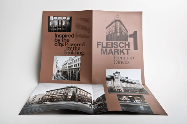
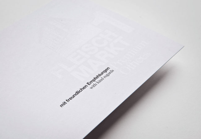
Am Fleischmarkt 1
Moodley Brand Identity.
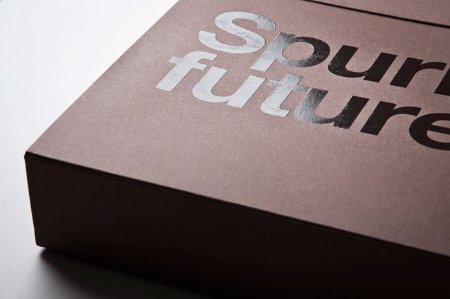
'Since the middle ages “Am Fleischmarkt 1” has always been a remarkable business address in Vienna. In 1909 a beautiful Art Nouveau edifice was built there — in terms of construction a real visionary building, because for the first time, reinforced concrete pillars, were used.
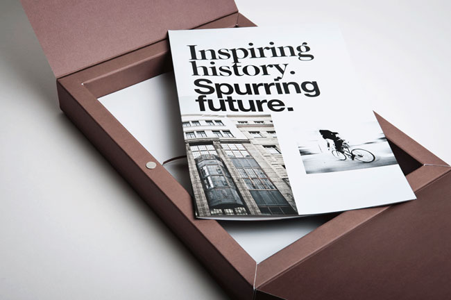
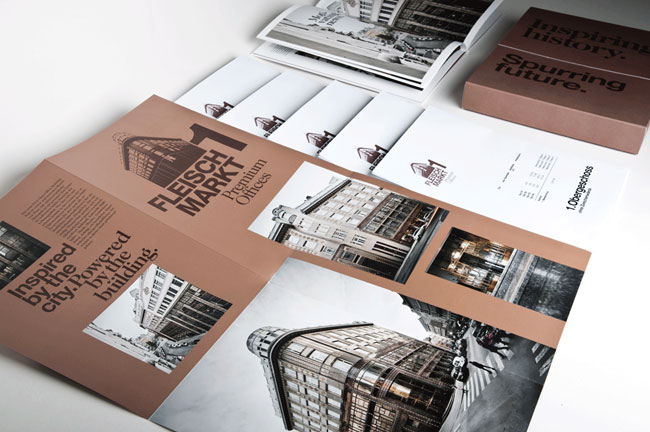
At the moment, the building is being revitalized in order to create new high-end business offices keeping true to its original style. The address branding that moodley brand identity was assigned to create should symbolize the inspiring history (the beautiful historical building itself) as well as the spurring future (high-end applications go together with an extreme high environmental compatibility).
Design decisions
The graphical identity of the building is influenced by the special architecture and its copper colours. A folder produced in larger edition is used as a pre-sale promotional item. A limited edition of a marketing box (containing floor plans, detailed descriptions of amenities, etc.) and a high quality image book not only describe the innovative interior design and the ecological benchmarks of the new building but also Vienna in general as a A1 business location.'

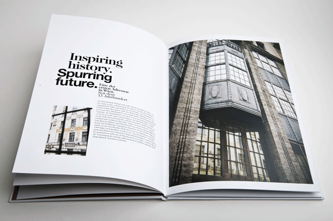
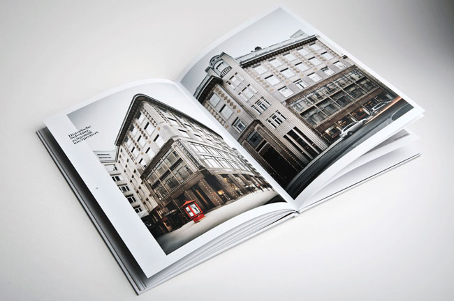
Simple layout. Firstly, there is a strong sense of direction within this spread. The two images reflect each other- geometric shapes are present and used to their potential. The image on the left leaf uses dark directional lines to push the focus onto the type. The type is surrounded by a lot of negative space, and the use of an image taking up all available space on the opposing leaf gives a lot of importance to this text.

I personally dislike widowed type- unless you want the viewer to read it in a fragmented way. However, the use of an image covering both pages, with type in an obvious but unimposing place gives power and impact, whilst the colour scheme connotes more of a pure feel.


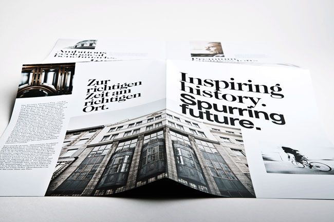
The type for the title seems too close together- i'm not sure whether this was a purposeful decision or not (I think it maybe was). However, I personally dislike it. There seems to be a lot of room to breathe in reference to this design when looking at the type and layout. But for the title it seems incorrect to me. I feel there could have been slight more spacing between 'Inspiring' and 'history' then 'history' and 'spurring', and also between 'spurring' and 'future'. The bottom of the p against the top of the t looks far too close- the history looks claustrophobic because of the lack of negative space. Though I do think this was purposeful as the same method has been adopted for the majority of title type within the design.

White on white, black on black- I love the delicate feel this has been given. You wouldn't notice it unless you took the time to look at the design.
'All used materials are made of high quality paper with many special print refinements.
Credits
Client: Amisola AG
Strategic advice creative & art direction: Gerd Schicketanz
Graphic design: Katharina Hölzl
Text concepts: Michael Endlicher
Photography: Andreas Balon, gregortitze.com
Production: Alanova Druckerei GmbH
Web: muevo (www.fleischmarkt1.at)
Product photography: Marion Luttenberger'
Client: Amisola AG
Strategic advice creative & art direction: Gerd Schicketanz
Graphic design: Katharina Hölzl
Text concepts: Michael Endlicher
Photography: Andreas Balon, gregortitze.com
Production: Alanova Druckerei GmbH
Web: muevo (www.fleischmarkt1.at)
Product photography: Marion Luttenberger'


Subscribe to:
Posts (Atom)