Am Fleischmarkt 1
Moodley Brand Identity.
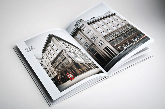
'Since the middle ages “Am Fleischmarkt 1” has always been a remarkable business address in Vienna. In 1909 a beautiful Art Nouveau edifice was built there — in terms of construction a real visionary building, because for the first time, reinforced concrete pillars, were used.
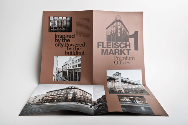
At the moment, the building is being revitalized in order to create new high-end business offices keeping true to its original style. The address branding that moodley brand identity was assigned to create should symbolize the inspiring history (the beautiful historical building itself) as well as the spurring future (high-end applications go together with an extreme high environmental compatibility).
Design decisions
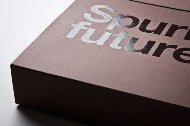
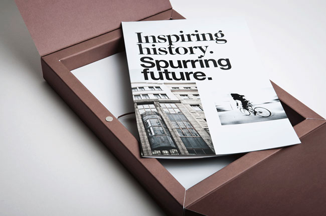
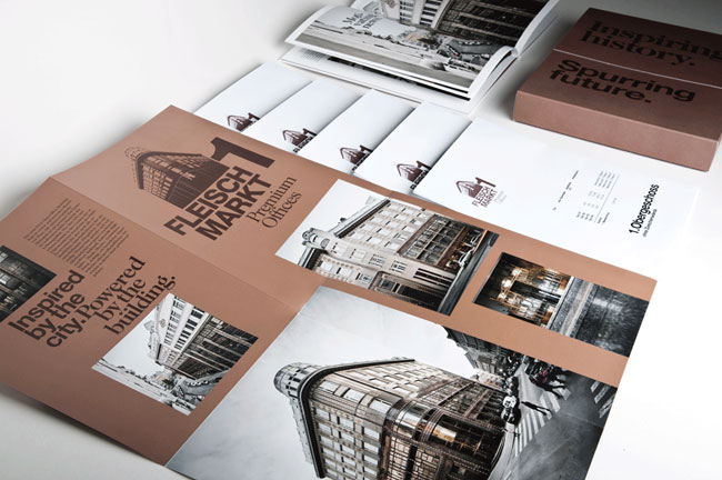
The graphical identity of the building is influenced by the special architecture and its copper colours. A folder produced in larger edition is used as a pre-sale promotional item. A limited edition of a marketing box (containing floor plans, detailed descriptions of amenities, etc.) and a high quality image book not only describe the innovative interior design and the ecological benchmarks of the new building but also Vienna in general as a A1 business location.'

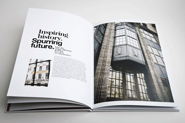
Simple layout. Firstly, there is a strong sense of direction within this spread. The two images reflect each other- geometric shapes are present and used to their potential. The image on the left leaf uses dark directional lines to push the focus onto the type. The type is surrounded by a lot of negative space, and the use of an image taking up all available space on the opposing leaf gives a lot of importance to this text.

I personally dislike widowed type- unless you want the viewer to read it in a fragmented way. However, the use of an image covering both pages, with type in an obvious but unimposing place gives power and impact, whilst the colour scheme connotes more of a pure feel.


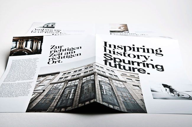
The type for the title seems too close together- i'm not sure whether this was a purposeful decision or not (I think it maybe was). However, I personally dislike it. There seems to be a lot of room to breathe in reference to this design when looking at the type and layout. But for the title it seems incorrect to me. I feel there could have been slight more spacing between 'Inspiring' and 'history' then 'history' and 'spurring', and also between 'spurring' and 'future'. The bottom of the p against the top of the t looks far too close- the history looks claustrophobic because of the lack of negative space. Though I do think this was purposeful as the same method has been adopted for the majority of title type within the design.

White on white, black on black- I love the delicate feel this has been given. You wouldn't notice it unless you took the time to look at the design.
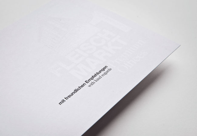
'All used materials are made of high quality paper with many special print refinements.
Credits
Client: Amisola AG
Strategic advice creative & art direction: Gerd Schicketanz
Graphic design: Katharina Hölzl
Text concepts: Michael Endlicher
Photography: Andreas Balon, gregortitze.com
Production: Alanova Druckerei GmbH
Web: muevo (www.fleischmarkt1.at)
Product photography: Marion Luttenberger'
Client: Amisola AG
Strategic advice creative & art direction: Gerd Schicketanz
Graphic design: Katharina Hölzl
Text concepts: Michael Endlicher
Photography: Andreas Balon, gregortitze.com
Production: Alanova Druckerei GmbH
Web: muevo (www.fleischmarkt1.at)
Product photography: Marion Luttenberger'


No comments:
Post a Comment