CMYK (Process) within Print.
Wellcome Collection, London:


Medical packaging has always been an
interest of mine. It is here where form follows function in every way.
The absolute aim within this packaging is communication. When it comes
to a persons health, they have to know what they are buying and it has
to be clear, and almost always has to be able to communicate effectively
to all age groups and sexes- the audience generally is everyone.
Some of the limitations include:

Along with many more.
This can leave little room to be creative within its design. One area I find it takes advantage of is space and colour.
Packaging and promotion:
Walter Bosshardt for Wiedenmann AG
Packaging and promotion:
Walter Bosshardt for Wiedenmann AG

The packaging above is a clever use of colour that communicates what it has to whilst still looking interesting. Consistency is key. It is not possible to say for certain that CMYK has been used here, but there are many signs that say so. For example, all medicine is mass produced, and therefore, so is the packaging. This means that it would be more economical for the design to use process colours rather than spot colours because of how plates are set up within the printers. Also, the colours used are fairly simple and look as if they could have been achieved through the process colours, unlike fluorescent which has to be printed as a spot colour.
Branding and Identity:
SocialTraders
Contributed by Daniel Peterson of Fabio Ongarato Design.

Social Traders
is an independent company working in collaboration with the Australian
government to facilitate support between business and community groups.
Fabio Ongarato Design’s (FOD’s) role was to determine a new identity and
visual language across all collateral supports that could exemplify
their significant uniting role. The corporate profile was created,
depicting Social Traders and outlining its strategic goals, current
initiatives and future priorities, in a visually dynamic way.


In creating the identity, FOD devised a ribboning motif that through
its folds, turns, and continuation created a visual motif for both the
journey and the challenge. The motif is featured throughout the profile
from the cover through to the thin show-through pages that are
french-folded to the back cover — a complete endless continuum.
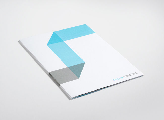

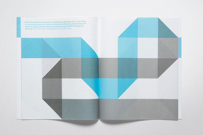


Really nice branding, using simple colour scheme that highlights the geometric shapes used. However, does reming me somewhat of the 'Wim Crouwel, A Design Odyssey Exhibition' branding at the Design Museum I went to earlier this year:

Newspaper Marketing Agency. Contributed by Simon Manchipp, co-founder of London-based SomeOne.

Ten years ago we helped launch the Newspaper Marketing Agency as well as the ANNAs (Awards for National Newspaper Advertising).
The NMA was set up by a group of major UK newspapers to help promote advertising in what was then viewed as a medium in decline.
It was seen as an overly-traditional channel when there were other
newer, more trackable ones to play with. Since then so much has
happened.
The inevitable rise of digital advertising (as of today, Google’s ad
revenue now outstrips ITV in the UK), paywalls, etc. means that
newspaper advertising arguably faces is toughest time yet.

But curiously the inverse is true and newspapers can offer more
targeted campaigns as well as successfully supporting broader
conversations in the media-mix of digital, TV, and newsprint.
Newspapers reach 8 out of 10 people in the UK every week.
We can all name great newspaper ads, but can you recall a significant
digital ‘classic’ that isn’t supported or lead by other media?
10 years ago, the identity we created was all about highlighting the uniqueness of newspapers and ‘quality in print’.
Today this seems a bit defensive, especially when newspaper
advertising can enrich experiences and develop conversations alongside
all the other channels competing for our attention.
To reflect this new age of converging conversations, we have evolved
the NMA into a brighter new world of adaptive colourful dialogue.

The conversation that has always been present on the letters pages of
the papers is now visible throughout the digital newspaper ecosystem.
The broadcast approach to branding is no longer appropriate, it needs to
flex to be part of the bigger conversation, not limited to a one-way
monologue so often seen in traditional branding.
What ever you call it, multi-channel/transmedia/convergence… the
digital age offers newspapers the chance to be reborn as the most
engaging and dynamic channels for readers and advertisers… because they
create what we crave, content that is timely and effortless to consume.

We didn’t throw the baby out with the bathwater. We kept all the good bits that gave the original it’s authority and detail.
We gave it a world to play in by introducing broad overlays of colour
that come from the faceted detail in the enhanced brand mark.
These can be changed and adapted for whatever content it covers.

We’ve created a new Brand World that enables communications of any
kind to be intelligently branded everywhere — without relying on
traditional one dimensional badging.
It becomes more human and approachable as a result.
A revitalised, re-energised NMA for a brighter future.

Information and Wayfinding:
Publishing and Editorial:
Design Museum, London.

This exhibition guide for the Design Museum has been printed using process colours. Simple imagery with simple overlaying text works extremely well, and also reflects the content. But if you're the Design museum, you're going to get it right.
Wallpaper.
Wallpaper* has collaborated with GFSmith
on a cover project that looks to celebrate the magazine's 15th
anniversary. 15 designers or brands were approached to each create a
special cover design, to be printed on Colorplan paper stock.
Collaborators include Build, It's Nice That, James Joyce, MadeThought,
Nike, and Spin...
"Wallpaper* asked us to commission 15 designers to each produce a
'celebrity' bespoke cover around the concept of Wallpaper* Famous for 15
years'," explains GFSmith's James Groves.
"In the true sense of bespoke, using digital printing by FE Burman, each cover design was printed on to the stock of the designer's choosing from our Colorplan range," continues Groves. "FE Burman pushed the printing by using many different processes including multiple passes of white ink. The results show how choice of paper plays an integral part of the design process."
"In the true sense of bespoke, using digital printing by FE Burman, each cover design was printed on to the stock of the designer's choosing from our Colorplan range," continues Groves. "FE Burman pushed the printing by using many different processes including multiple passes of white ink. The results show how choice of paper plays an integral part of the design process."

James Joyce's design is printed on Cool Grey

A good point to remember when printing CMYK. So long as all the colours are in the gamut range you can still produce a bright, busy piece of design- doesn't have to be a spot colour all the time. Most of the time, especially for me, available resources will only allow for CMYK printing. I need to learn how to make my designs reach their full potential when using process colours.
Sourced from 'Good Food' magazine.

The colours used here are process colours. Block colour against imagery can not work at all, or can work very well. Here, it is the latter. The colour scheme of beige to blue works beautifully and communicates effectively. Should think about this when adding text to my designs. Especially editorial.
No comments:
Post a Comment