Logo Designs:
Optimistic Beverages
Love the concept. Hate the design. This is such a clever idea, one that for me, hasn't got old after looking at it so many times. -And I think it is that which is important within logo design. In my opinion, this illustrated, block style is tired and obvious, however, I can see the logo reaching its targeted audience which would focus more on the idea than the design. So, in a sense, I suppose it is therefore a good logo? Surely, if all that is behind a logo speaks to its audience, it doesn't matter if graphic designers dislike it?

By Helms Workshop
Committe of Organ Donation in Lebanon:

Brief:
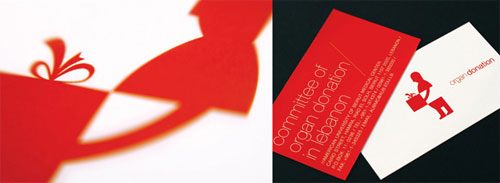
To design the corporate identity for an organ donation initiative. Since it was our only tool of communication, the design had to instantly convey the message of organ donation. Whatever we designed had to strike an emotional chord and subtly prompt people to open up to the idea.
To design the corporate identity for an organ donation initiative. Since it was our only tool of communication, the design had to instantly convey the message of organ donation. Whatever we designed had to strike an emotional chord and subtly prompt people to open up to the idea.
Creative execution:
When you pledge an organ, you gift someone a new life. We simply brought this insight to life through our design.
When you pledge an organ, you gift someone a new life. We simply brought this insight to life through our design.


This is just lovely. Just very very lovely.
British Steel logo
A quick excerpt from John L. Walters‘ interview with David Gentleman
about the British Steel logo — in use from 1969 until 1999 when the
company merged with Koninklijke Hoogovens to form Corus Group (Corus was
bought by Indian steel company Tata in 2006).

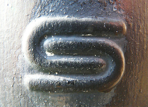
In relation to the image above, I have been reminded that my logo wont just be a two dimensional digital design, it will have to be applied to different contextual surfaces.
JLW: How did the British Steel commission come about?
DG: Through a neighbour, Will Camp [British Steel’s
director of information services]. They had commissioned ideas already
but they didn’t like them, so he came in one day and said will you give
it a go.
JLW: Was that done quickly?
DG: Very quickly, yes.
JLW: I’ve read that it stemmed from a visualisation of the steel process — is that true?
DG: It came first from my own wish to suggest that
steel was strong and flexible. Only later did I discover that steel was
bent in order to test its strength — so I used this as a rationale, but I
didn’t know that at the time!
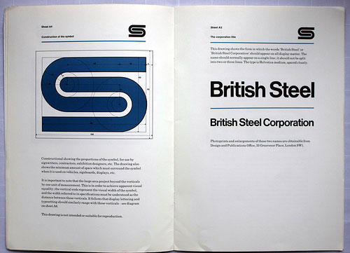
This logo is simple, bold and powerful- I think it is these elements which make it a memorable visual logo. However, there is also some contextual concept behind it, which strengthens the whole idea of what this logo is the face of.


No comments:
Post a Comment