Stock options & Print finishing.
Branding and Identity:
Outside Photographic.
Contributed by London-based art director Andreas Neophytou.

Outside Photographic is a photographic agency based in London. Its clients range from fashion to music, working with brands such as Jaeger, Nicole Farhi, GQ, Wondrland Magazine, EMI, Mercury Records and Warner Records.
Heavy gsm black stock. Foil blocking embossing. Not sure exactly how the white ink was printed, UV litho, but difficult to tell. Unless it was just white foil. Perhaps it was created through white foil.
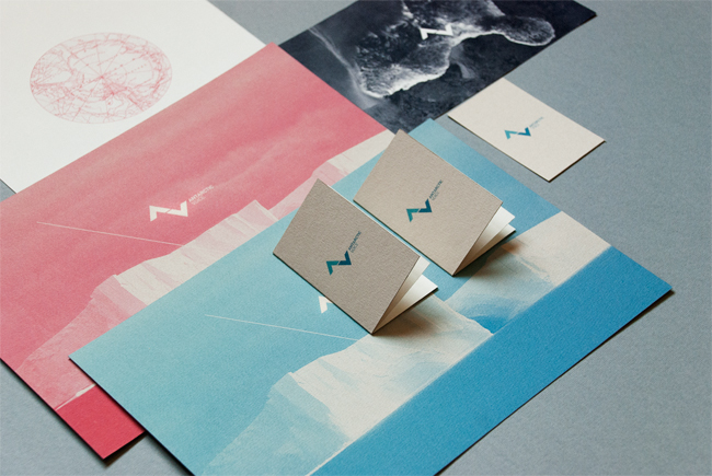
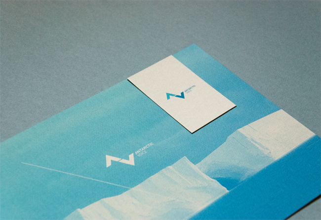
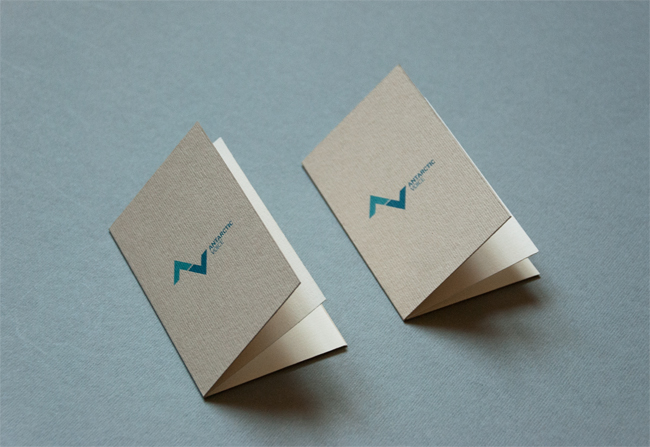
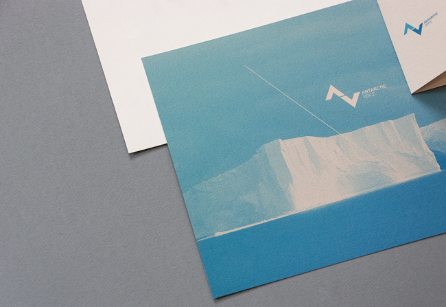
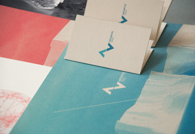
Antarctic Voice. Contributed by Slava Kirilenko of Kazakstan-based Astronaut Design.
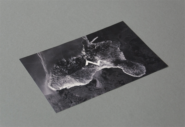
Antarctic Voice is a project that aims to express the voice, the
silence and the magic of the unattainable continent, Antarctica.

Beeswax Candle.


Matt Heavy gsm stock. The logo is heavy and reliable, much like the stock used- the concept is full circle.
Packaging and Promotion:
Leeds poster stands.


These
poster stands in Leeds are perfect promotion for upcoming gigs and
openings. They are everywhere. In my opinion they are very effective,
more than once i've found myself stopping in front of a poster to see
what the event is. A durable, preferably glossy stock is used on these
stands to retain quality through different weather conditions. There is
also a paste over them to heighten durability. A lot of prints tend to
be one/two colours plus stock. This is to keep down costs and also
give impact- if a poster looks simple the viewer will take in the
information. I should keep this point in mind when designing for an
audience who are more likely to be walking past rather than stopping to
appreciate the design of the poster.


Promotional
poster for London based graphic design agency 'DRY'. A heavy black
stock has been used, with what I think is screenprinted over black white
image, then with gold foiling on top of all that. Unfortunately there
is no information of the context of this poster. I don't know what size
it is or where it is designed to be seen. I know it works in getting
my attention.
Publishing and Editorial:


FRAME magazine. For their latest issue, foil block was used to give a feel of luxury that reflected the subject matter of the main story within. The foil blocking against the matt stock gives an expensive feel with a textured look.
Three days + 16 illustrators = 3,750 drawings. CRIllustration, Magazine / Newspaper


Each cover of TQ comes from a different part of the original drawing.

Close-up of the grid
"We mapped out the overall canvas on the floor of the warehouse, but
didn't show any of the illustrators the actual borders of each cover,""We just tried to maintain even coverage overall, safe in
the knowledge that the covers would kind of choose themselves, rather
than us choosing them."

The full poster insert showing thumbnails of 2,500 individual cover sections


The illustrators who worked on the project were Ryan Chapman, Jasper
Dunk, Dale Edwin Murray, Daniel Frost, Matthew Hams, Yasmeen Ismail,
Jean Jullien, Chetan Kumar, Paul Layzell, Maggie Li, Dominic Owen,
Hattie Stewart, Toby Triumph, Robbie Wilkinson, Paul Willoughby, and Dan
Woodger.
Information and Wayfinding:
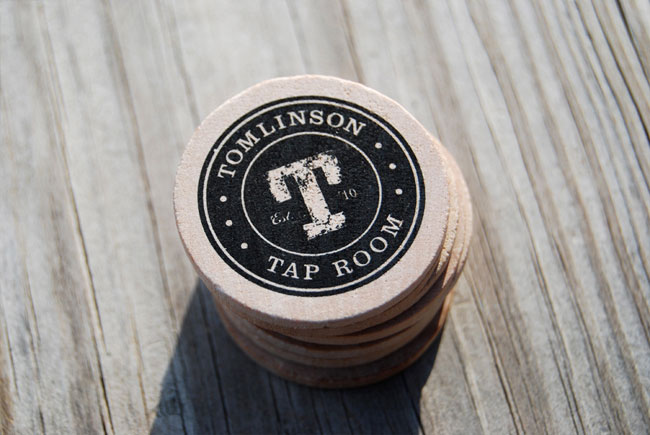
Tomlinson Tap Room
Contributed by Isaac Arthur of Indianapolis-based CODO Design.

Experience specifics
After the identity system was finished, we carried the identity through to wooden nickels (street team pieces redeemable for beer samples), coasters, pint glasses and growlers, t-shirts and the social media presence.
Signage is a challenge due to limitations on what we can and can’t do within the historic space. No drilling, hammering or gluing presents an annoying challenge. Our solution was a mobile pint-glass-shaped sign that carries the Tomlinson identity out onto the street in front of the city market.

The back bar itself was sourced from a historic 1920′s Hook’s Drug Store, meshing beautifully with the Tap Room’s ambiance.
One of the more celebrated promotional pieces is the Tomlinson Tap Room Passport. There are over 35 breweries in Indiana, and more opening every year. If you have a pint or growler fill from every brewery, then you become a ‘Tomlinson Regular’ getting your name placed within the bar.


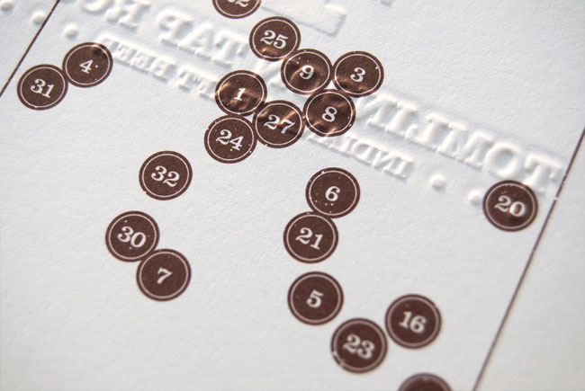
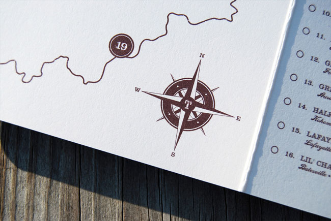
Due to one color printing and a heavy deboss, we were able to create a tactile keepsake that represents huge bragging rights for beer geeks and a lot of money spent within the bar.
Extremely well executed. One colour printing and debossing with a heavy stock is simple, bold and effective. Though in the last image the stock seems to have cracked slightly, however, it is not entirely certain whether that is the desired effect or not.
No comments:
Post a Comment