
Generation Press.
One of the first pieces of advice we were given was that we have to "manage our expectations". More specifically with colour. There are so many factors that have to be thought about that can change print. For example, a colour will never print exactly the same as the pantone reference book, (even if the same stock is used) because of the amount moisture within that paper. The moisture affects the print because of 'dot gain'- this is the amount of surface ink covers once it has reached the paper. It will always increase, but there are ways of controlling that number- i.e. amount of moisture in paper. Dot gain is how colour is measured in print. Another point,it seems obvious, but it is easy to forget, that stock choice also changes the assigned colours, cheaper stocks generally tend be less pure white, with a hint of yellow. This undertone of colour will taint the initially designed/ desired colour.

When working with images for print, you can think of it as an "iceberg"- there is so much data under the surface of the initial photograph when it is imported into programmes. First of all, ALL images must be shot in RAW. format, this is because it is possible to hold much more information this way, which will work to your advantage when editing, and even further when sending to print. There are certain ways to edit images. If you do not edit your images correctly then you end up modifying, deleting, cutting, adding aspects that it looks amazing on screen, but when it comes to printing the image is fuzzy and full of noise- and this is something that I nor anyone else needs/ wants in life. Use curves and selective colours- and very little else, so that the original data of the image is still stored. Only go as far as +5% and -5% or else information will begin to get lost, reducing the quality of the final print.
Tints: It is VERY difficult to print any tint at 50%. If you want around that amount try 55%
Also, don't confuse tints with transparency and opacity- it happens TOO often

CMYK and Spot Colours. If working on a job it comes to light that you are using too many spot colours and it will be to expensive to do so, you can generally find some form of CMYK replacement. This usually works best with coloured panels/ boarders/ headings and such like. So, if you convert these colours to CMYK and look at the percentages, you may find a certain colour with a very low percentage. If this occurs, try taking out that colour fully, and adding to another higher colour, e.g. if Y was 3% and M was 96%, have a go at upping the percentage to 100%. This creates a less muddy colour that can sometimes look very similar to the desired spot colour.

"Simplifying your artwork is key to giving it a crisp finish".
Print Considerations:
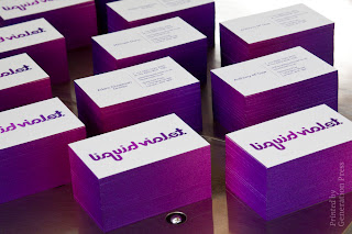
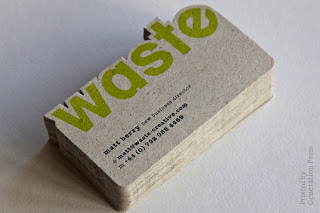
Stock considerations. Make sure that not only does the stock you choose look good, but that it is relevant also. It gives the concept more depth, adding quality to the overall design.
No comments:
Post a Comment